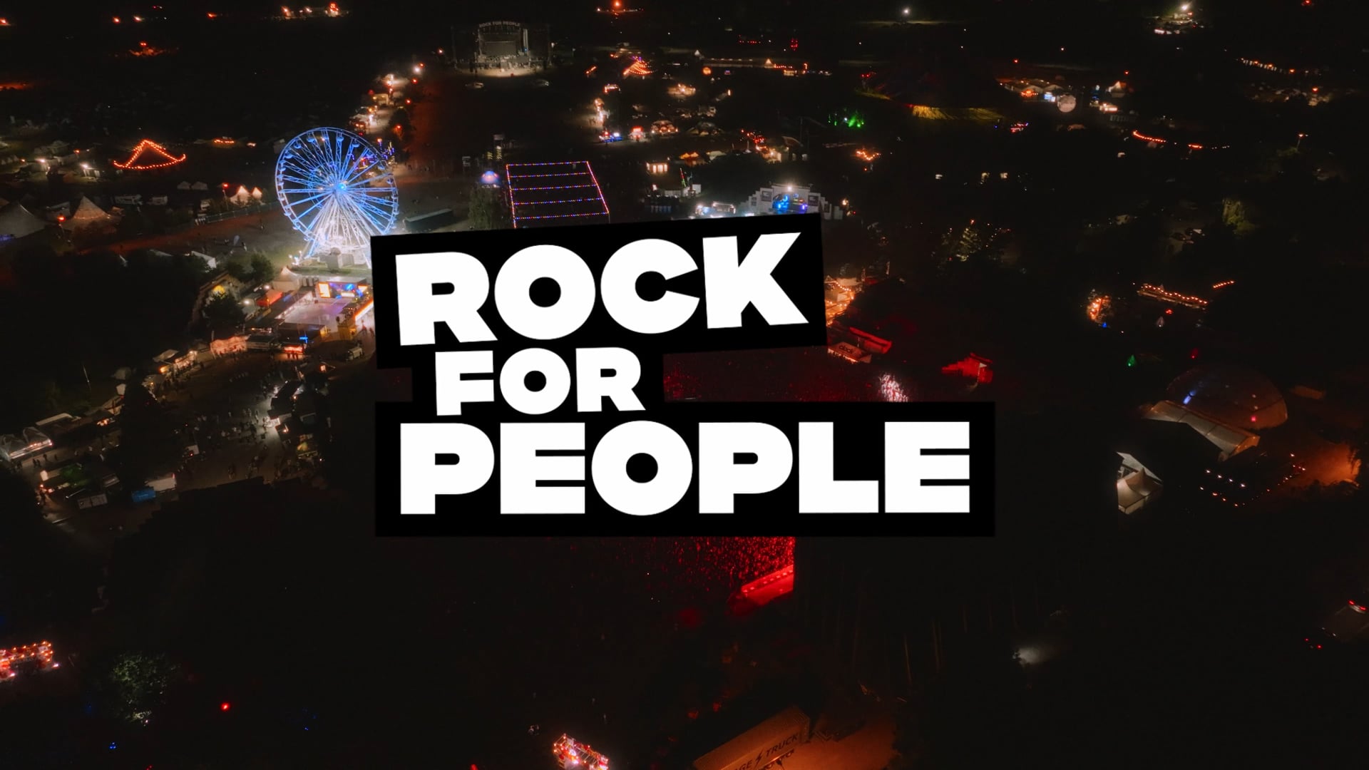
Rock for People
Future of music festivals: Getting Bigger by Getting Clearer
What we do
- Brandtruth™ Strategy
- Campaigns
- Digital Design
- Motion & Video
- Visual Identity
- Web Development
Overview
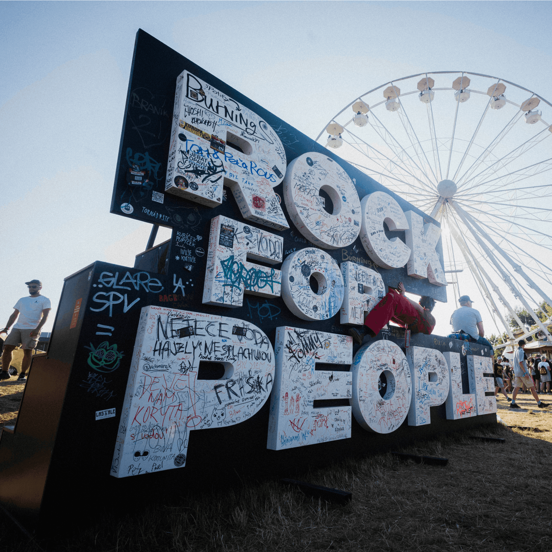
Over the past year, we’ve worked on the identity of Rock for People, one of the largest music festivals in Central Europe, based in the Czech Republic.
What sets it apart, beyond the audience’s unique energy and its amazing line-up, is its dedicated venue: Park 360. A permanent festival site that enhances the music experience with a level of infrastructure few others can offer.
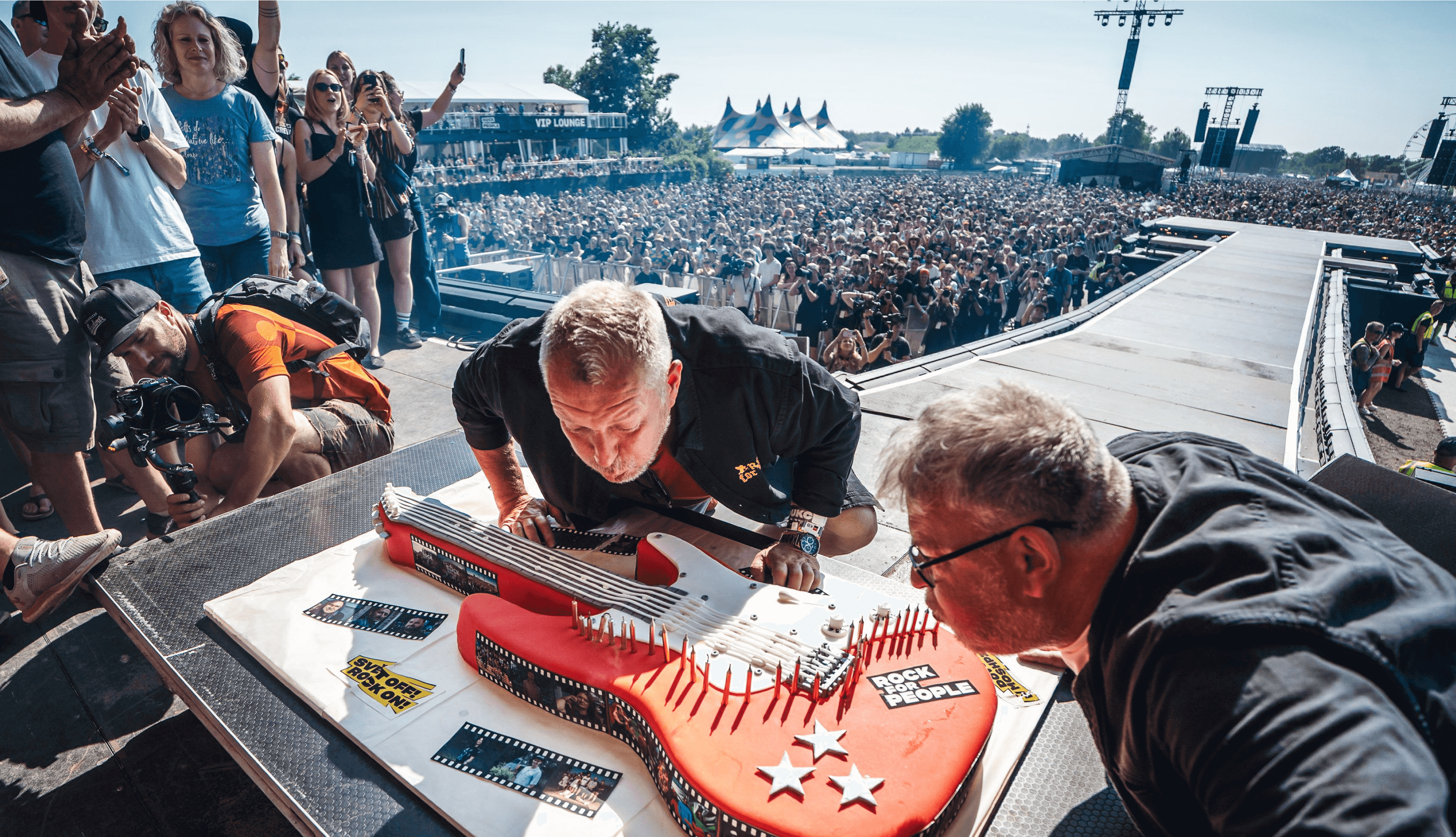
Our task? Evolve the Rock for People brand ahead of a major milestone: growing its audience from 30,000 to 50,000 for its 30th anniversary.
The challenge
We knew we were solving two opposing challenges at once.
On one hand, an ambitious plan to grow. On the other, the risk of losing what made the brand special. What if the festival didn’t grow enough, or worse, lost its identity along the way?
Strategy
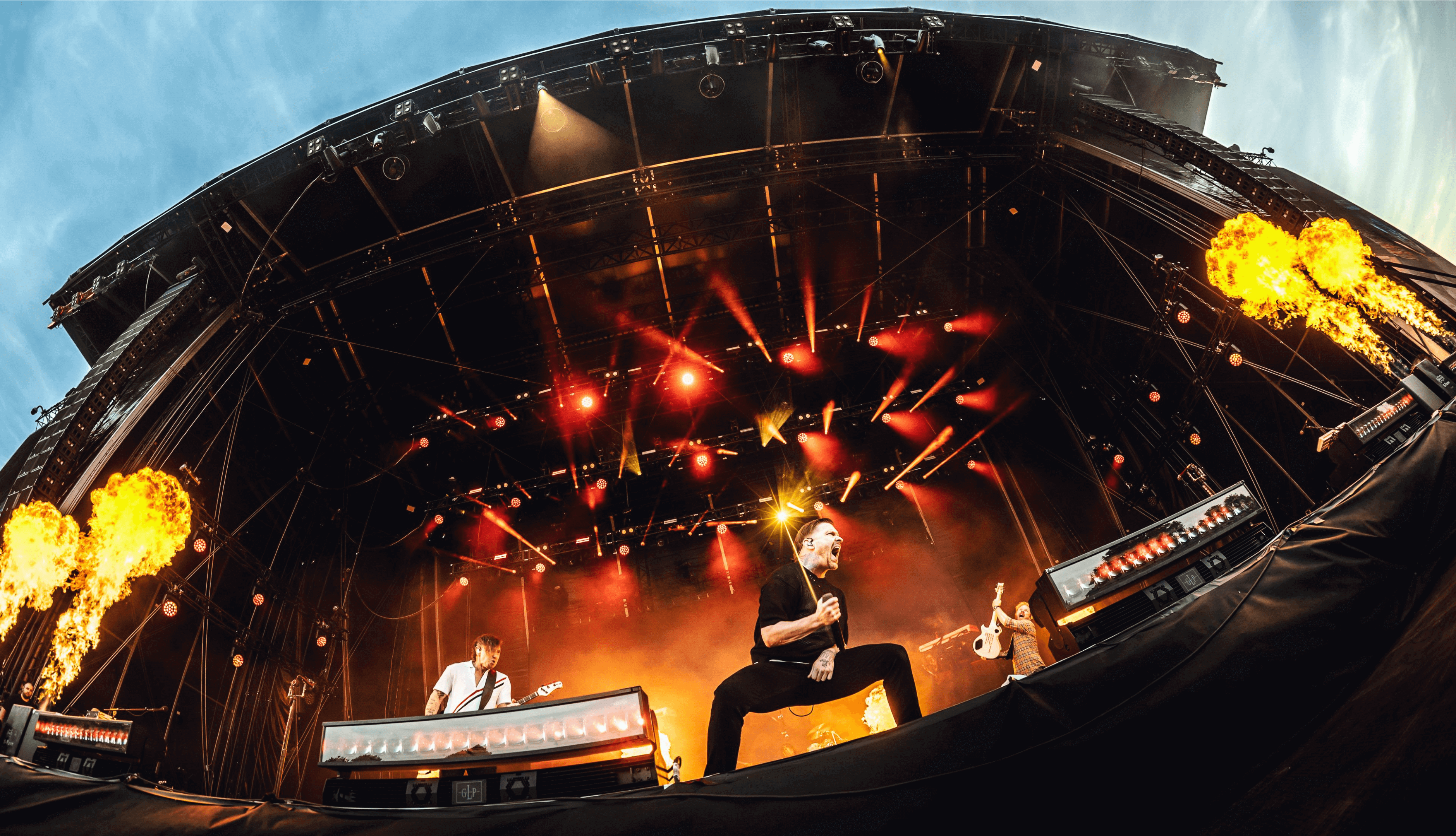
Our strategy connected the festival’s raw energy with the deeper reason people keep coming back: five intense days that power you through the rest of the year. We shifted the narrative from something you want to something you need. This is your therapy. Rock Therapy.
We cleaned up the Rock for People brand making it clearer, more emotionally resonant, and easier to connect with.
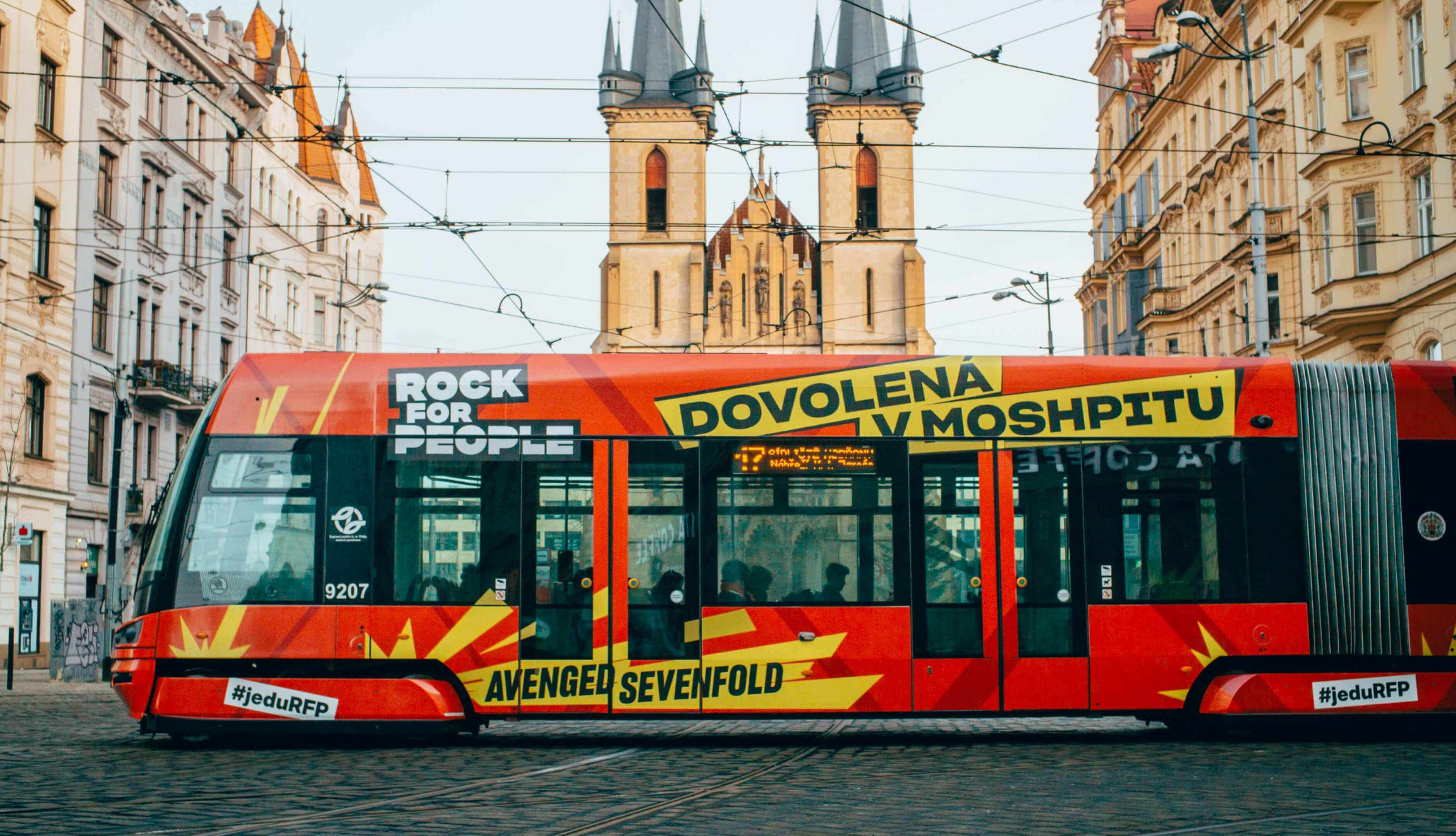
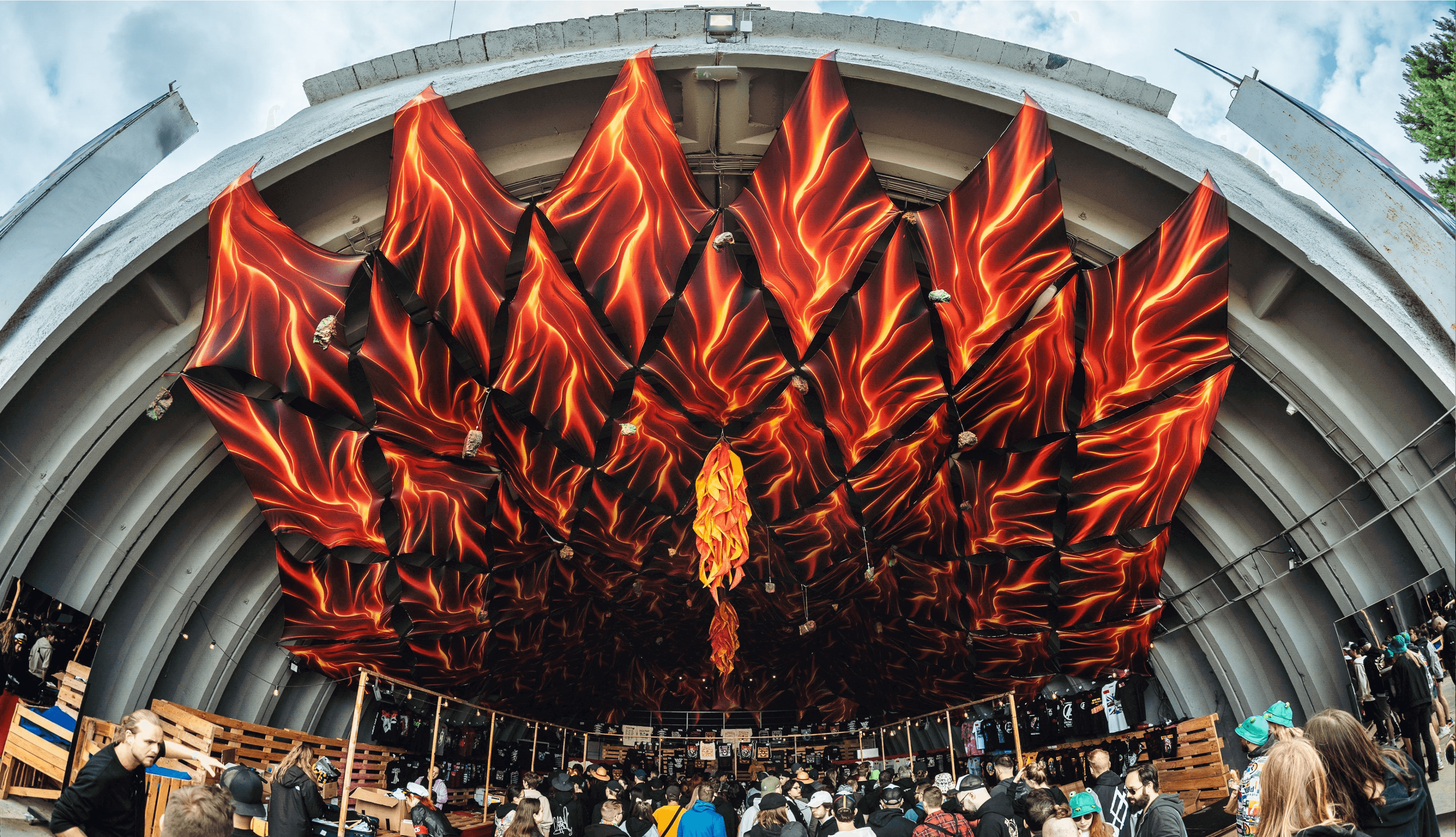
The festival’s visual identity mirrors its spirit: bold, energetic, and unapologetic. Behind it stands a flexible visual and motion system, designed to work seamlessly across digital platforms, print, stage animations, and venue signage.
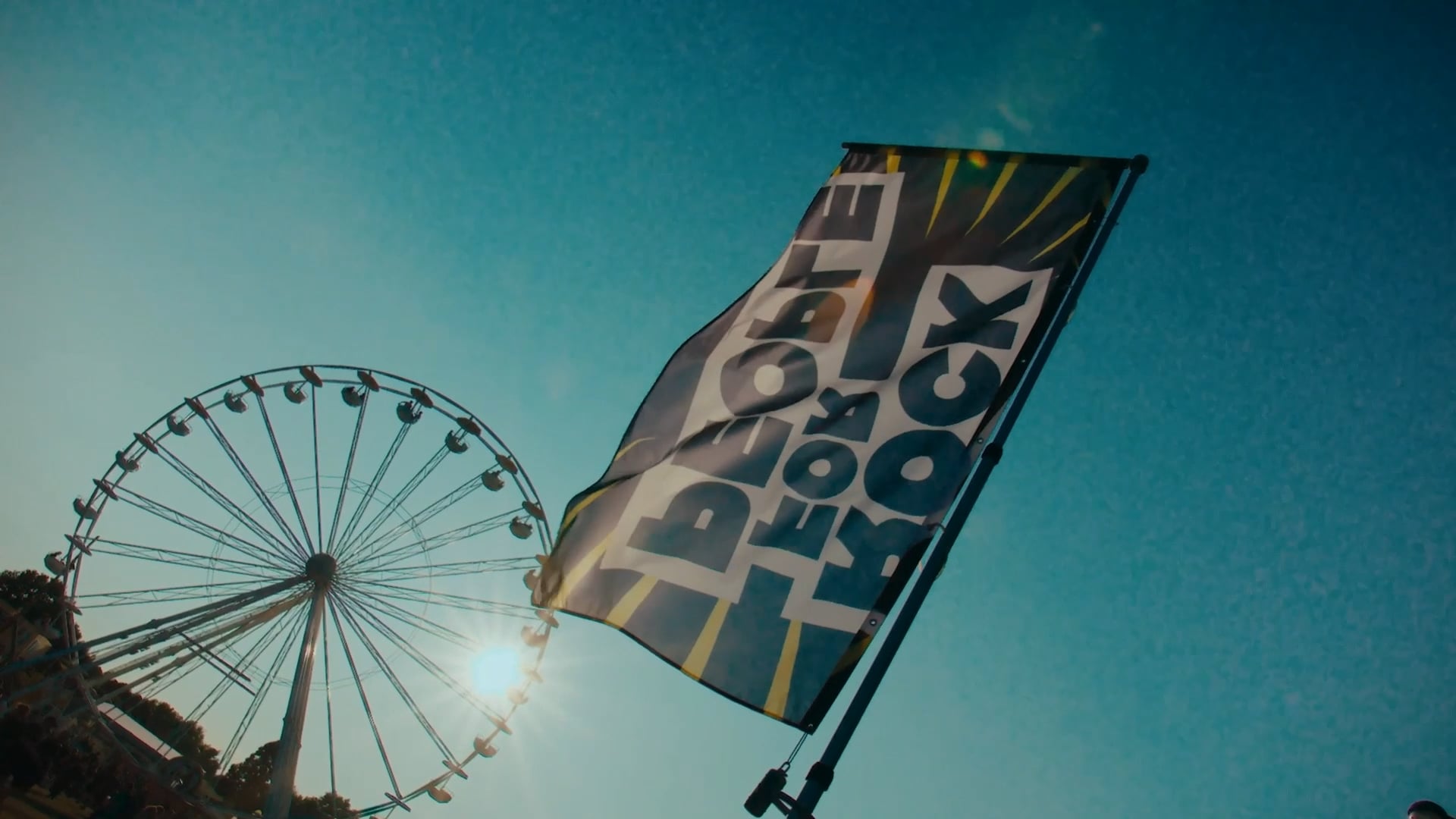
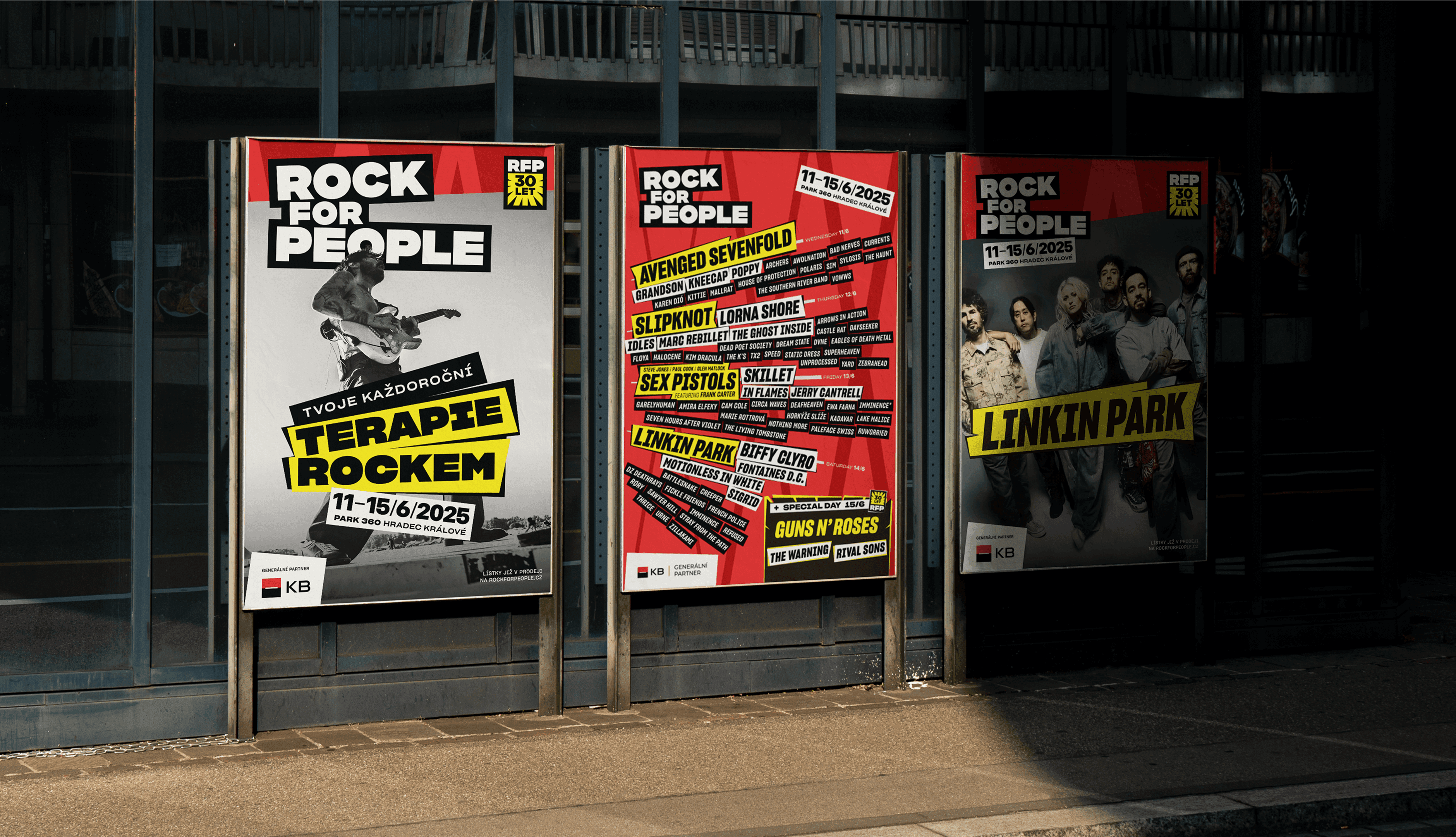
Visual Identity
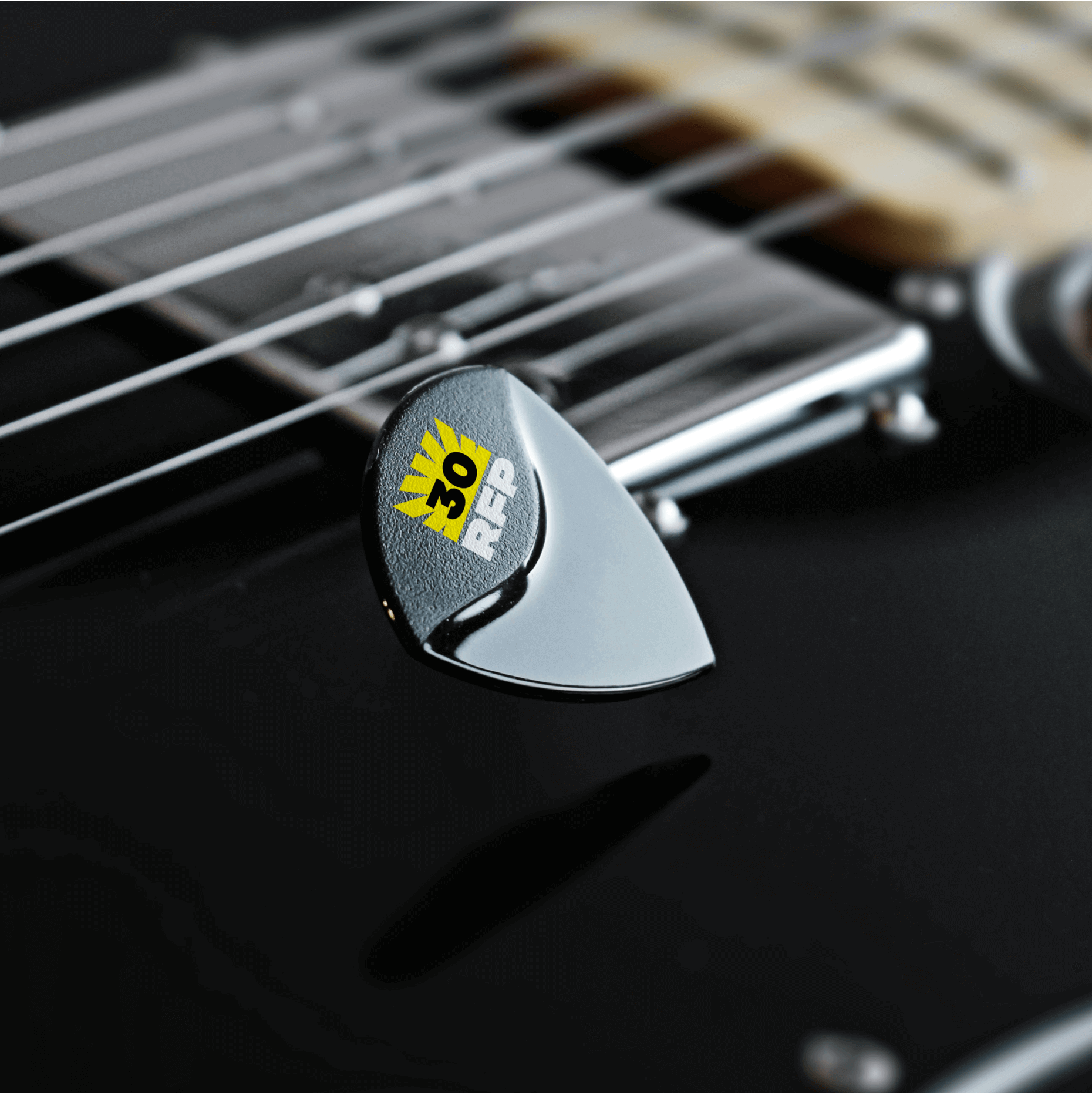
The RFP brand has two layers. The first is the permanent part: logo, colors, and basic typography. It’s built to last at least five years, maybe ten. This keeps the festival consistent and easy to recognize, both in the Czech scene and across European rock festivals.
The second layer changes every year. Each edition gets its own visual look, completely different if we want. The only rule is to follow the basics of the permanent branding.
The yearly design can reflect the lineup, a theme, or a milestone like a 30th birthday or a new venue. In 2025, the main idea was an explosion. What’s next? You’ll see.


Result
+20k
increase in visitors compared
to the previous year17mo
of work from the first brief
to the festival925h
spent on the project
867m2
of OOH visuals exported
for each campaign batch
What they say
“You are not a brand or identity studio. You are a business studio, able to understand complicated products and make them easy to understand for clients and customers.”
Oldřich Bajer
Co-Owner, Rock for People
Credits
- Jakub Ptačin
- Pavol Kyselica
- Maroš Ľuba
- Michal Chovaňák
- Martin Pyšný
- Adrian Mititelu
- Kamil Ansorge
- Rebecca Schultzová
- Jakub Koričanský
- Ondrej Jób
- Pablo Marin
- Tomáš Paulen
- Marián Balog
- Pavol Pružinec
- Jozef Koleják
- Alex Korosfoy
- Tomáš Jadroň
- Jakub Dušička
- Lubo Briestenský
- Matúš Hliboký
- Jozef Pálenik