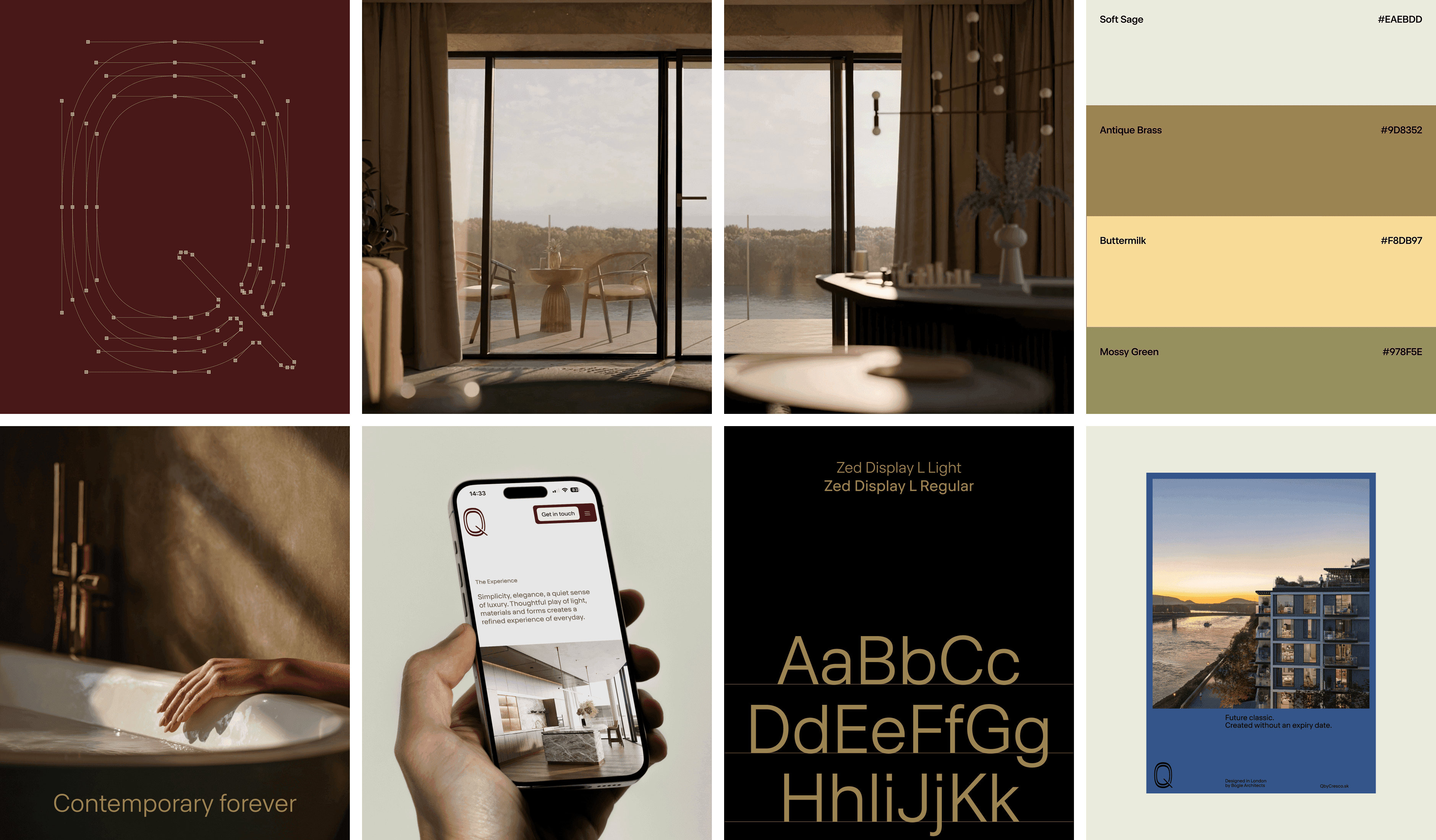
The name Q is intentionally minimal and open to interpretation. It references flow, force, and question — the right question that reveals what truly matters. By saying almost nothing, the name reflects the essence of the project: less expression, more meaning.
A Quiet Brand, Amplified Value
Q avoids real estate clichés. Instead of promises and superlatives, it focuses on rhythm, proportion, and permanence. We approached the project more like a high-end fashion brand than a traditional development.
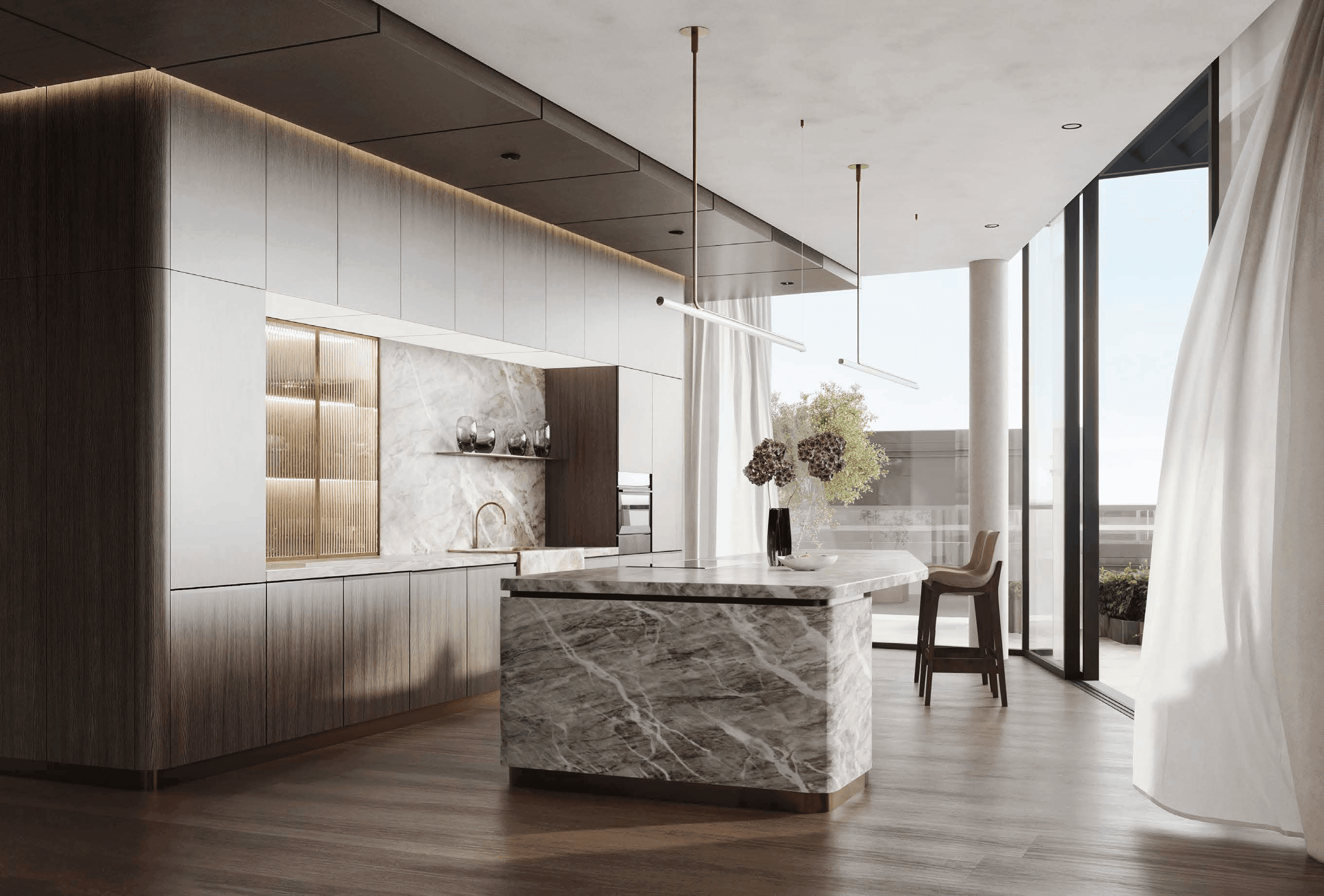
Architecture, material quality, and time itself become the primary value carriers. The brand claim Contemporary Forever defines the ambition clearly: relevance today, and relevance decades from now.
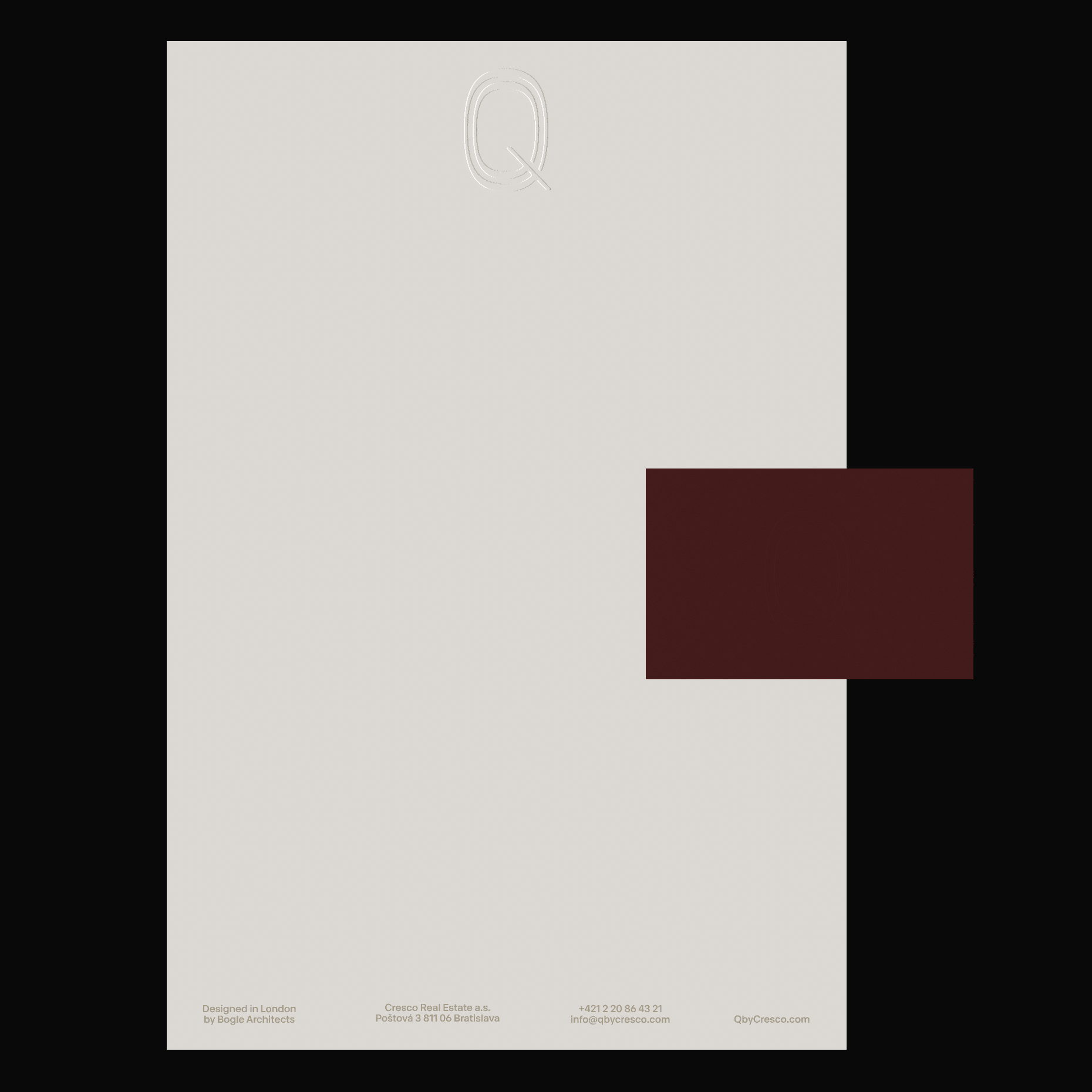
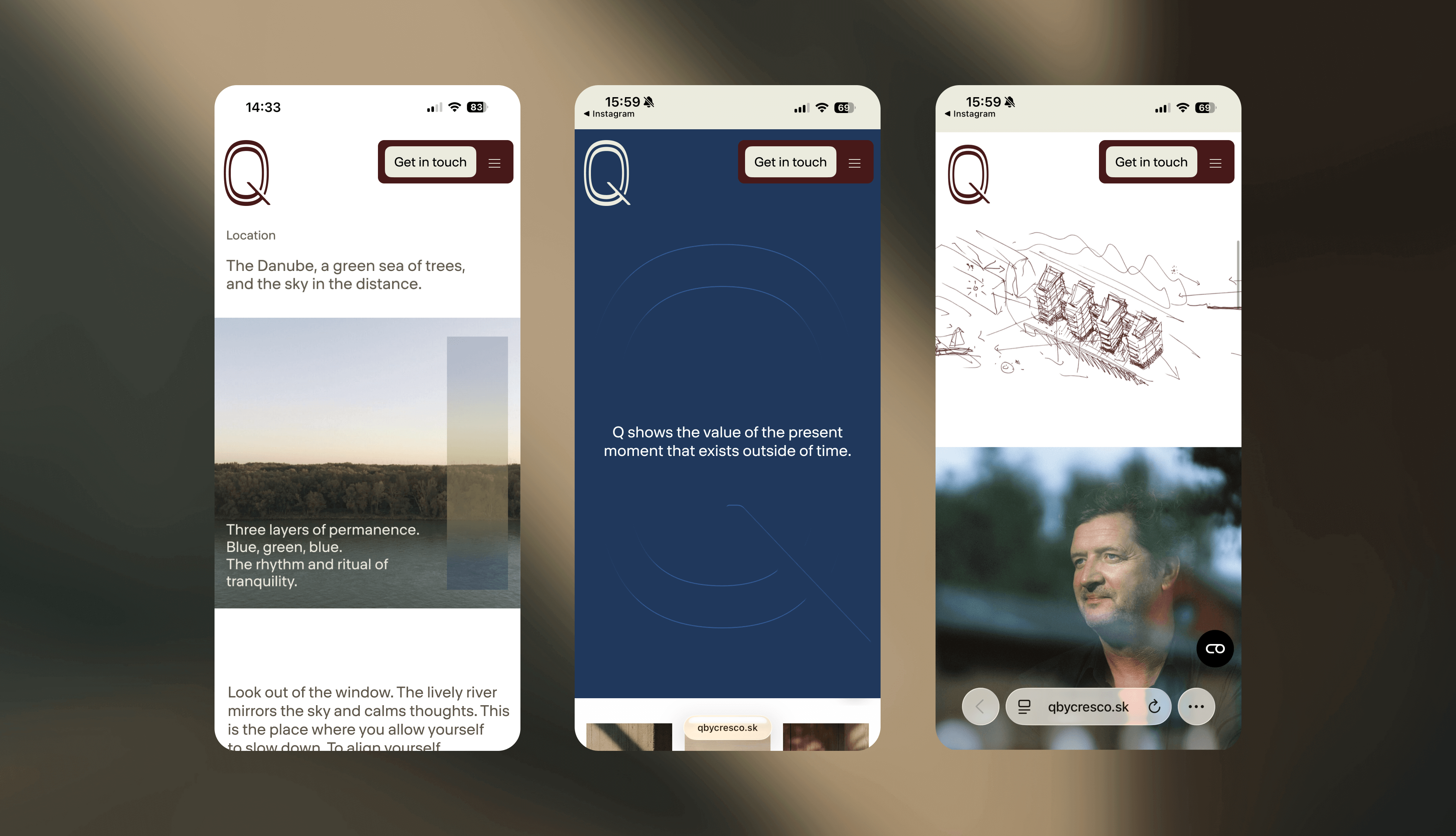
The visual identity is built on restraint. Clean typography, muted tones, precise detail, and intentional use of negative space. Silence functions as a design element. Every touchpoint, from print to web, reflects quiet quality and long-term value.