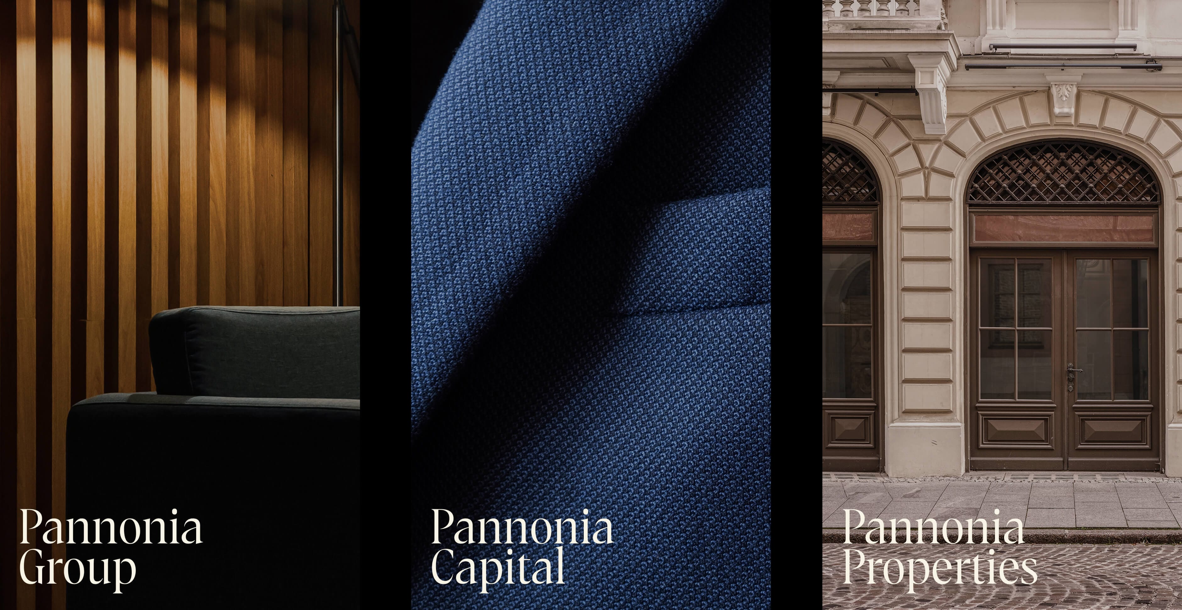
Pannonia Group
A brand destined to leave a lasting legacy
What we do
- Brandtruth™ Strategy
- Print Design
- Visual Identity
- Finance
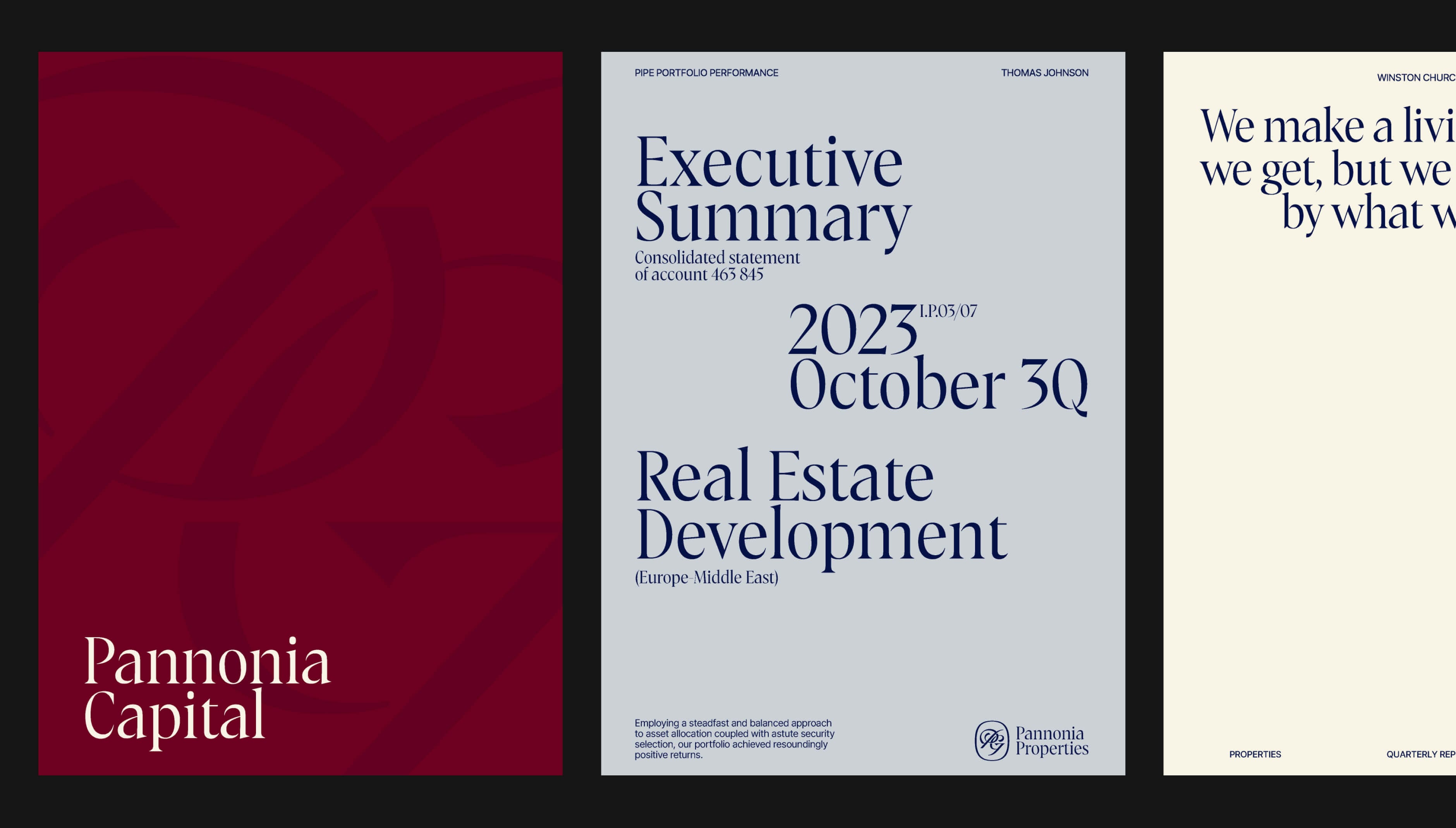
Overview
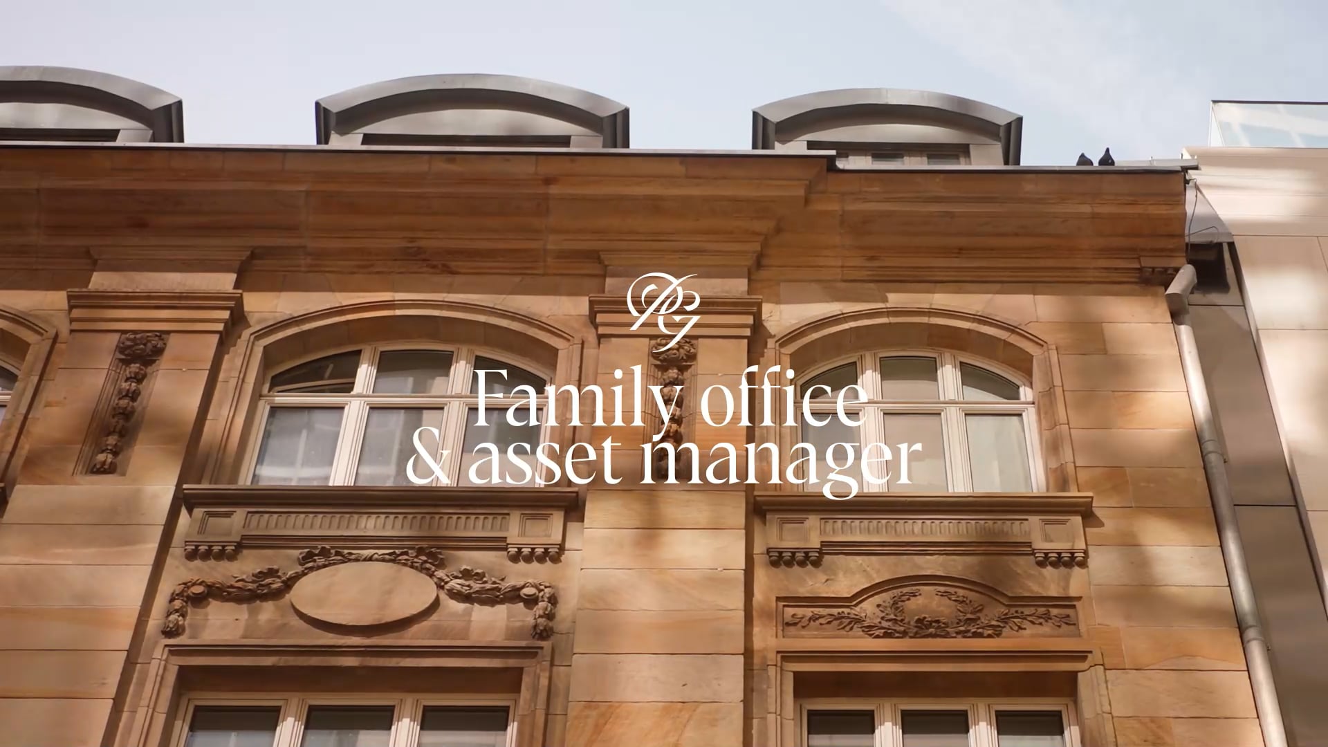
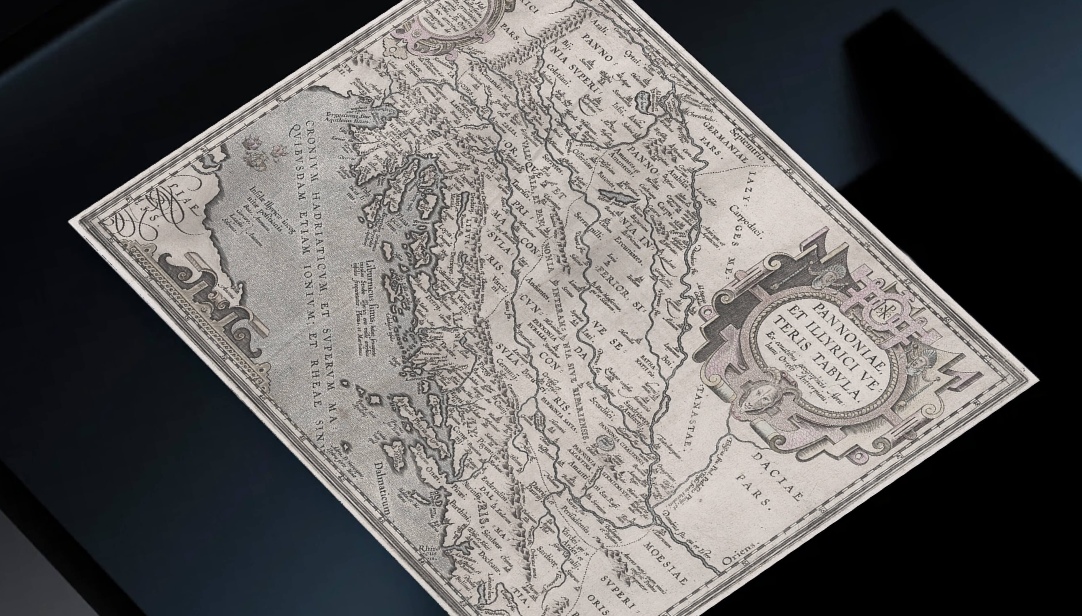
We recently collaborated with a new family asset management firm. Headquartered in a Slovak region once part of the Roman province of Pannonia, the inspiration behind the company’s name.
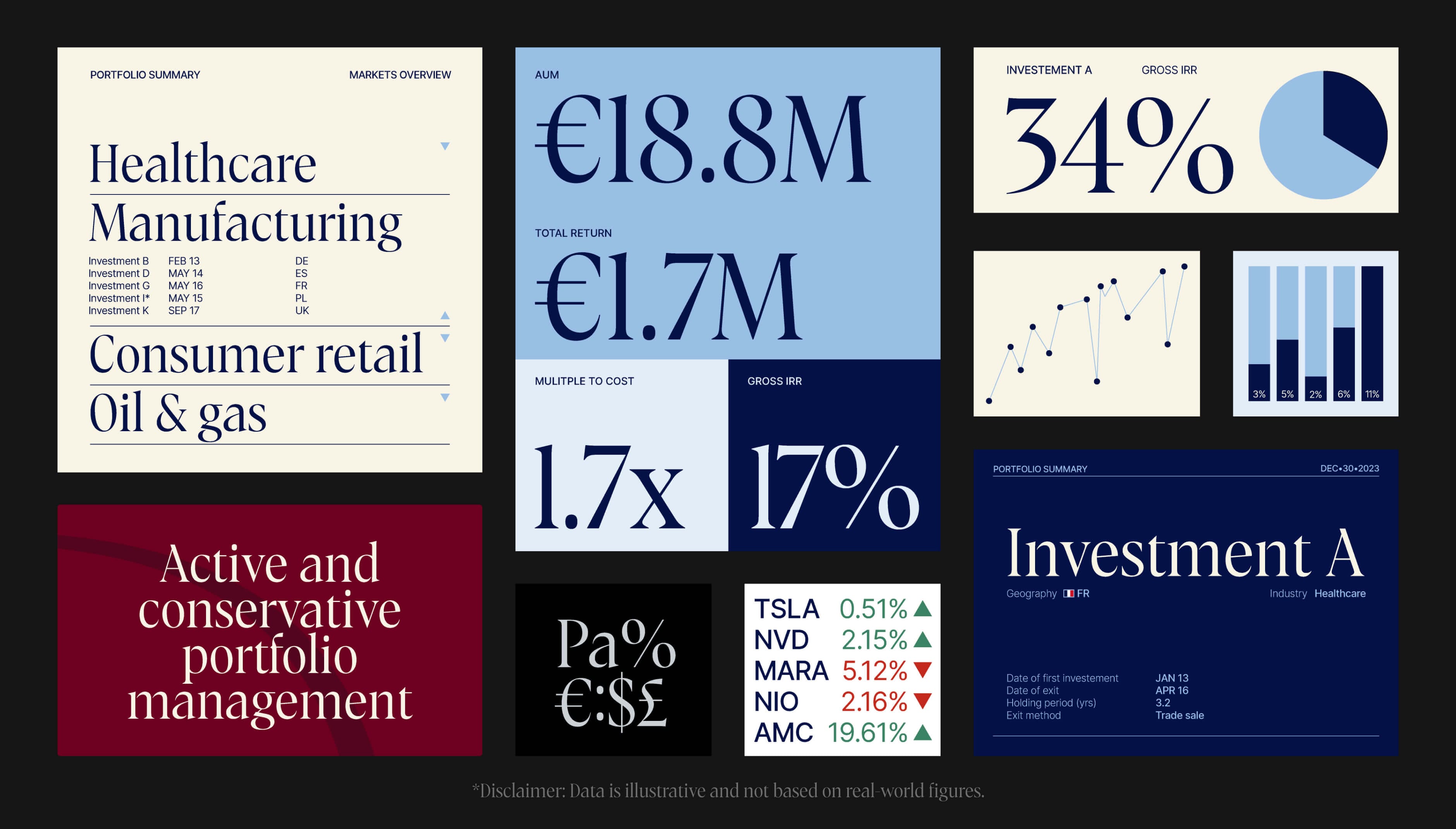
The firm stands out through diversified investment strategies and a proven track record. But in a market full of options and short on genuine values, the challenge was clear: how to build an identity that emphasizes a forward-thinking co-investment approach, signals long-term impact, and positions the firm as top-tier yet accessible?
The answer was to present the firm as reachable primarily through trusted relationships and personal introductions, a balance between distinction and approachability, without ever trying too hard to impress.
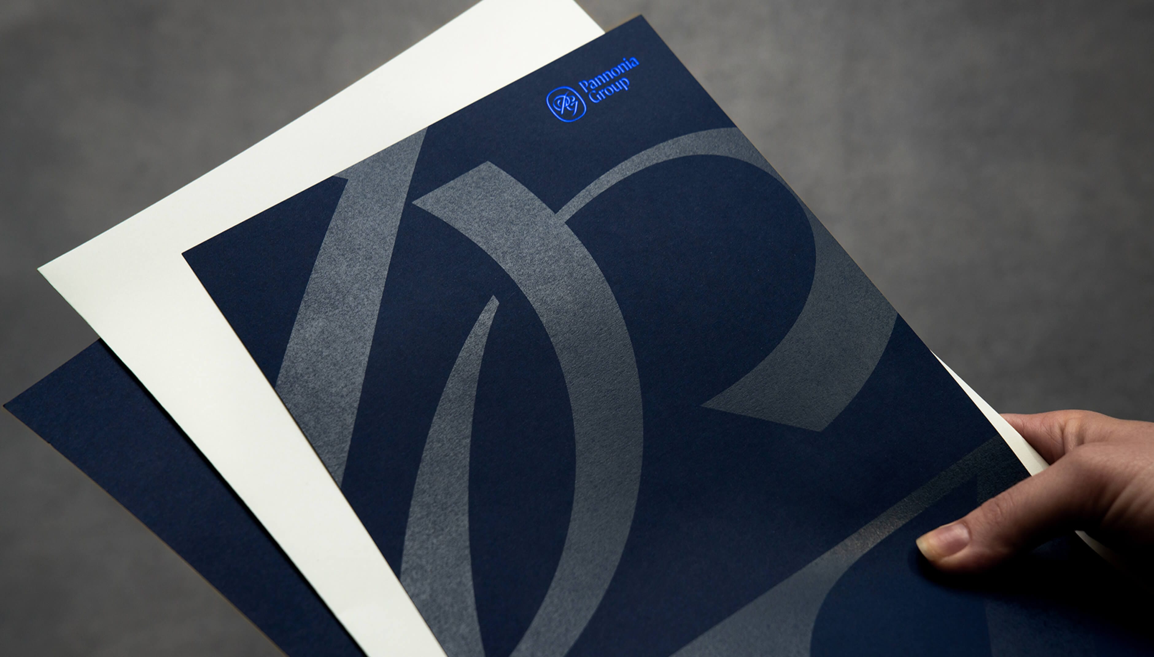
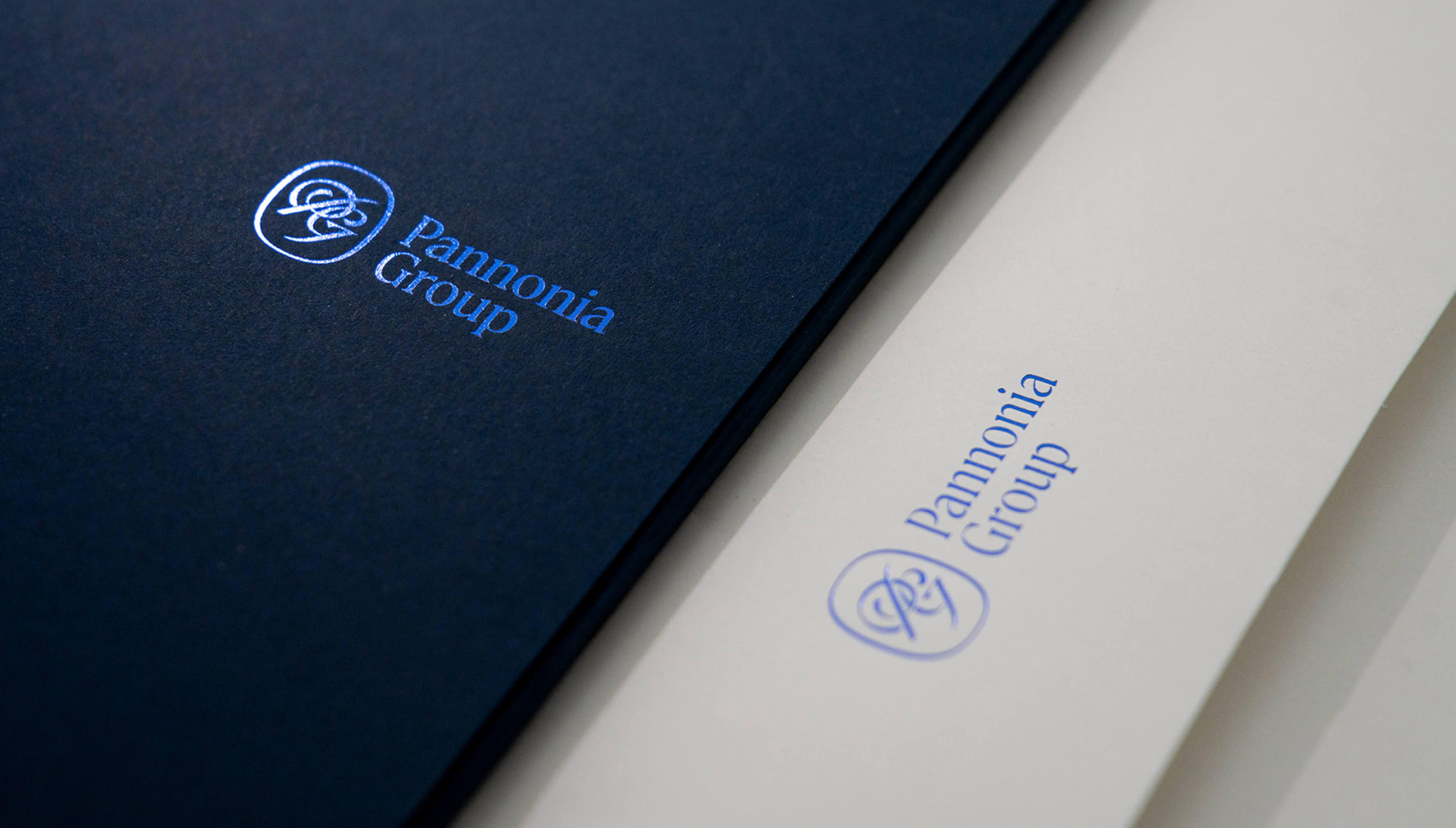
Bespoke
Typeface
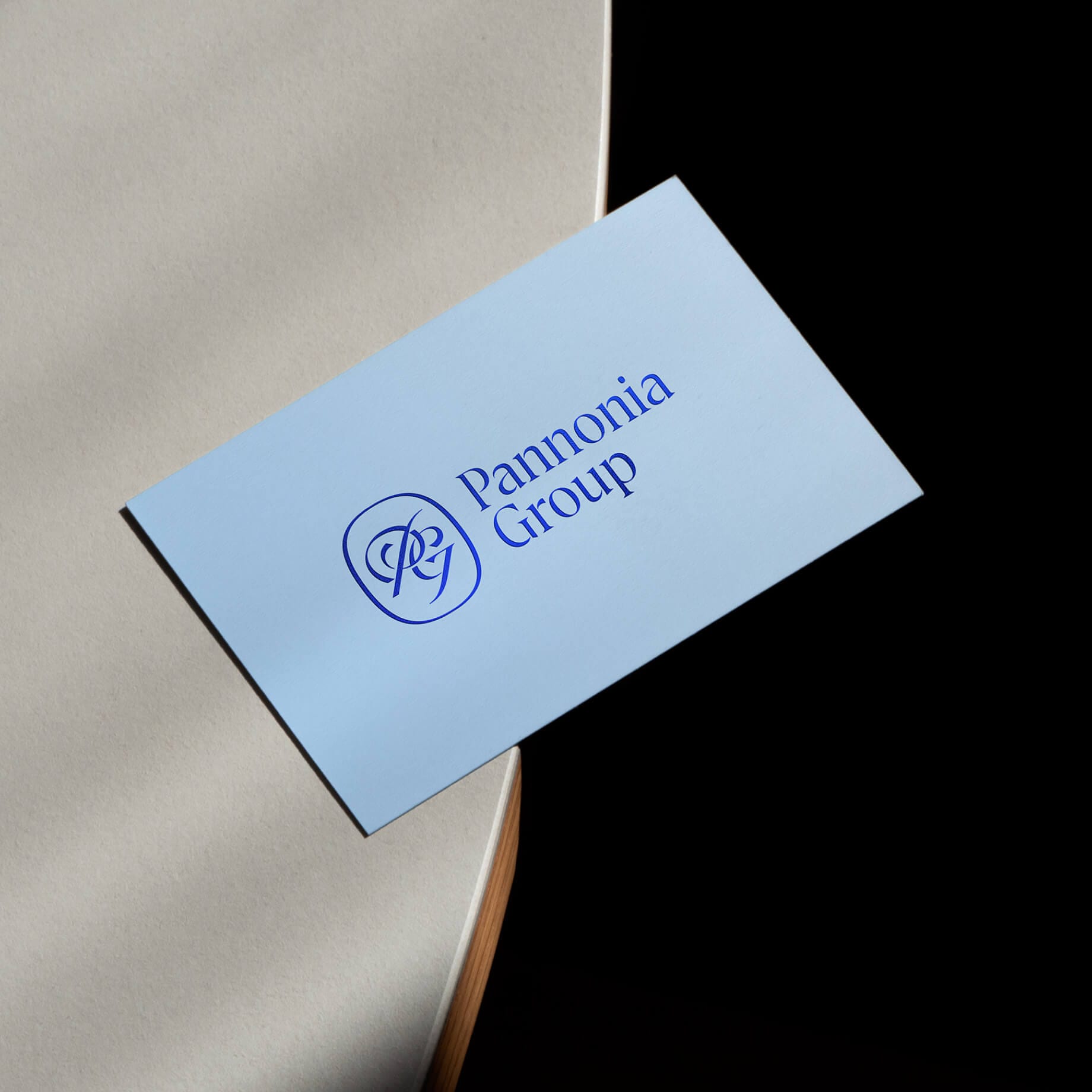
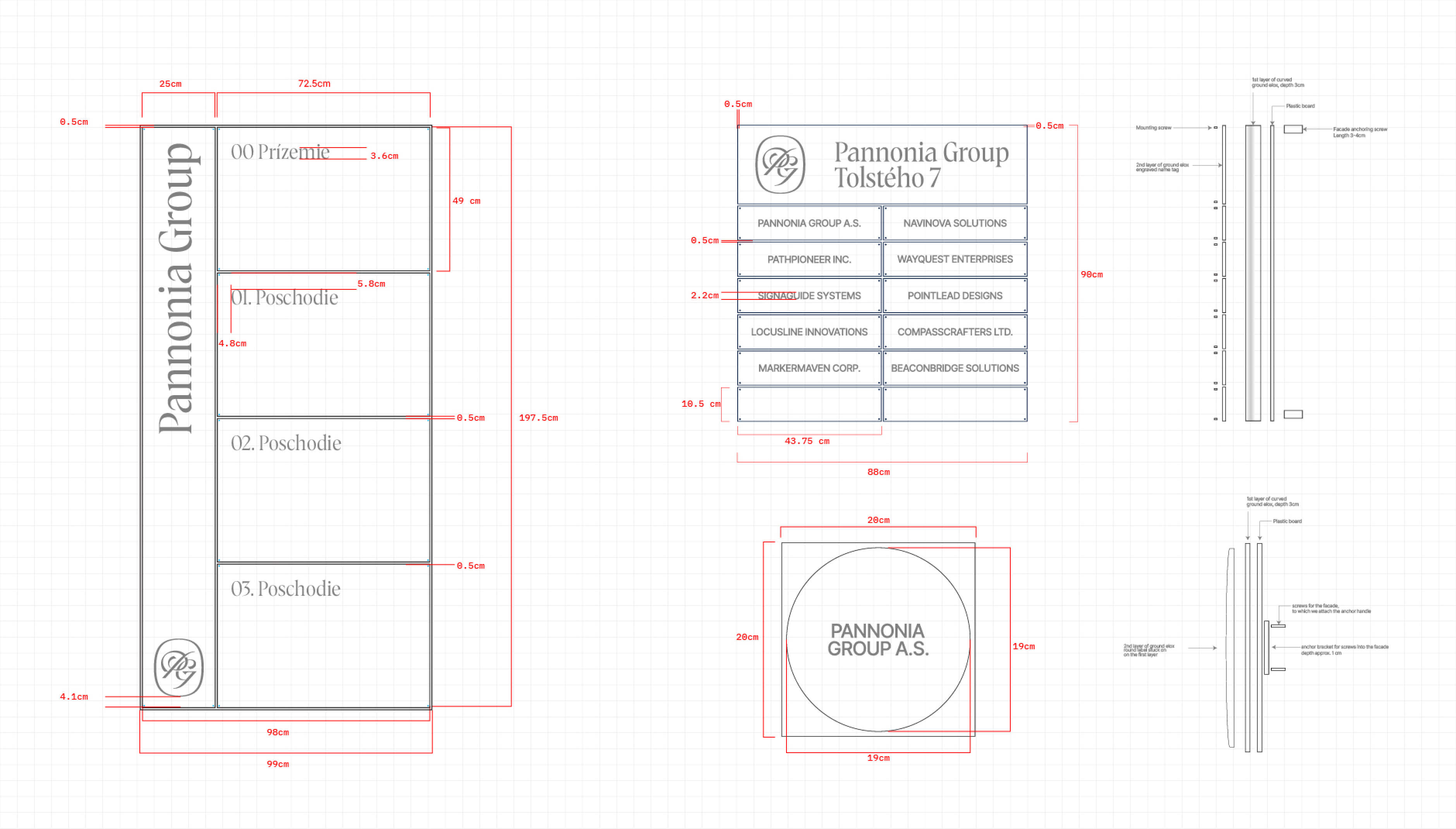
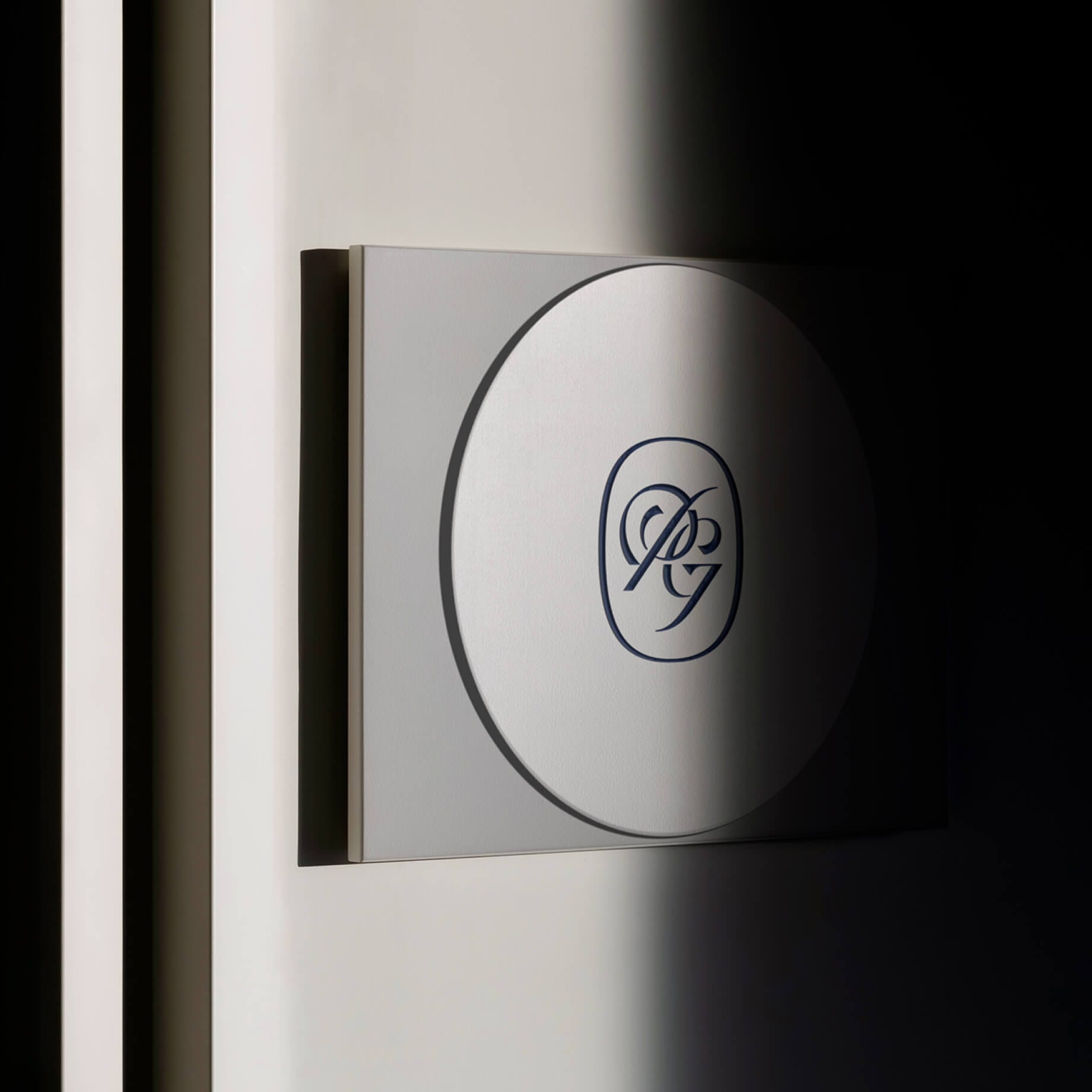
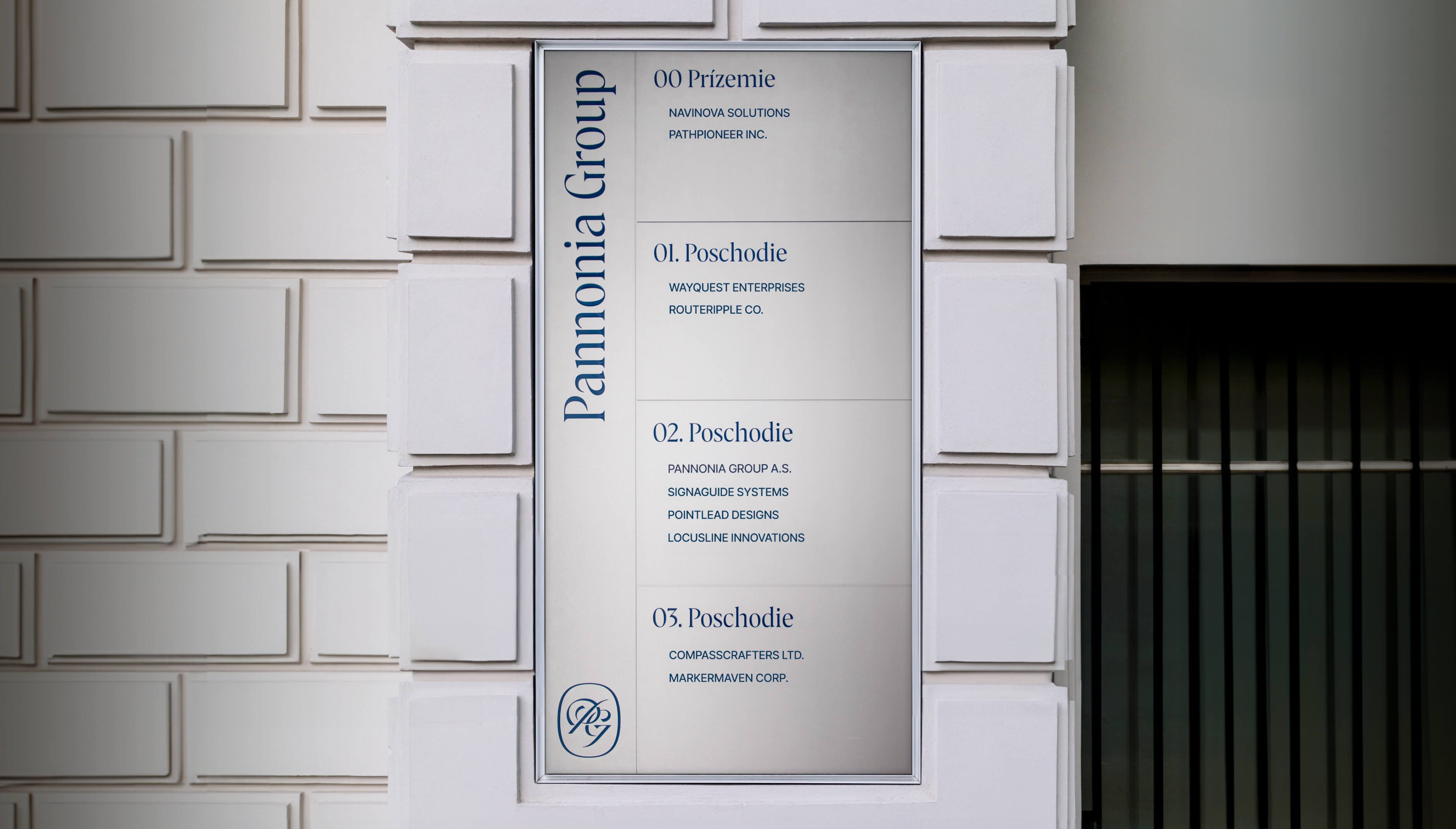
A thoroughly designed monogram, “PG”, stands at the heart of the visual strategy. It acts as a symbol of the firm’s dedicated professionalism and timeless values.
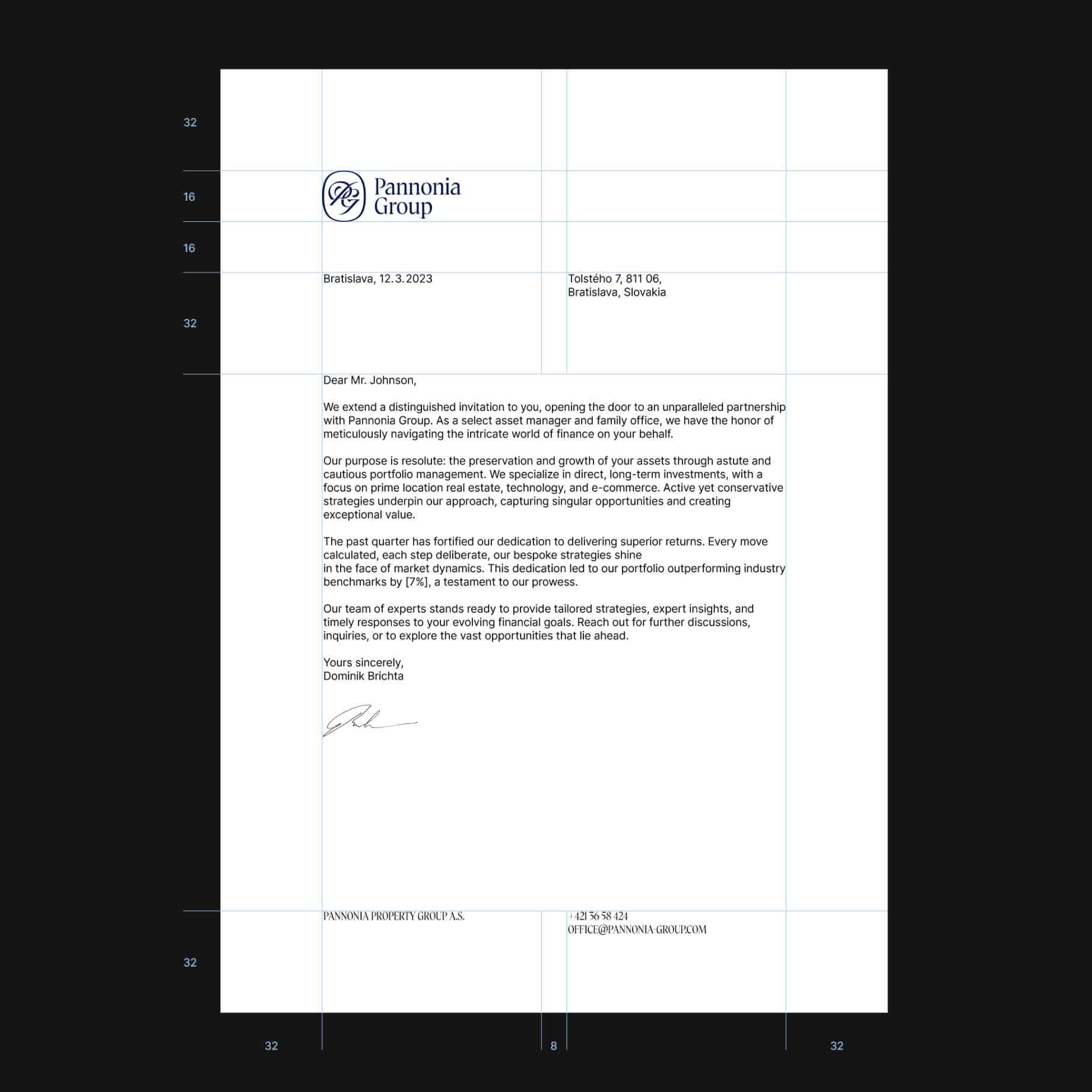
The bespoke typeface, inspired by Roman script, casually complements the monogram. Together, they represent the brand’s main ambition. In fact, every design decision – from the bullet paper to the wayfinding system of the historical buildings in their portfolio – is meant to support this effort: to help the firm build a long-lasting legacy.