Dunaj
Reviving an architectural and cultural symbol of the city
What we do
- Visual Identity
- Real Estate
Overview
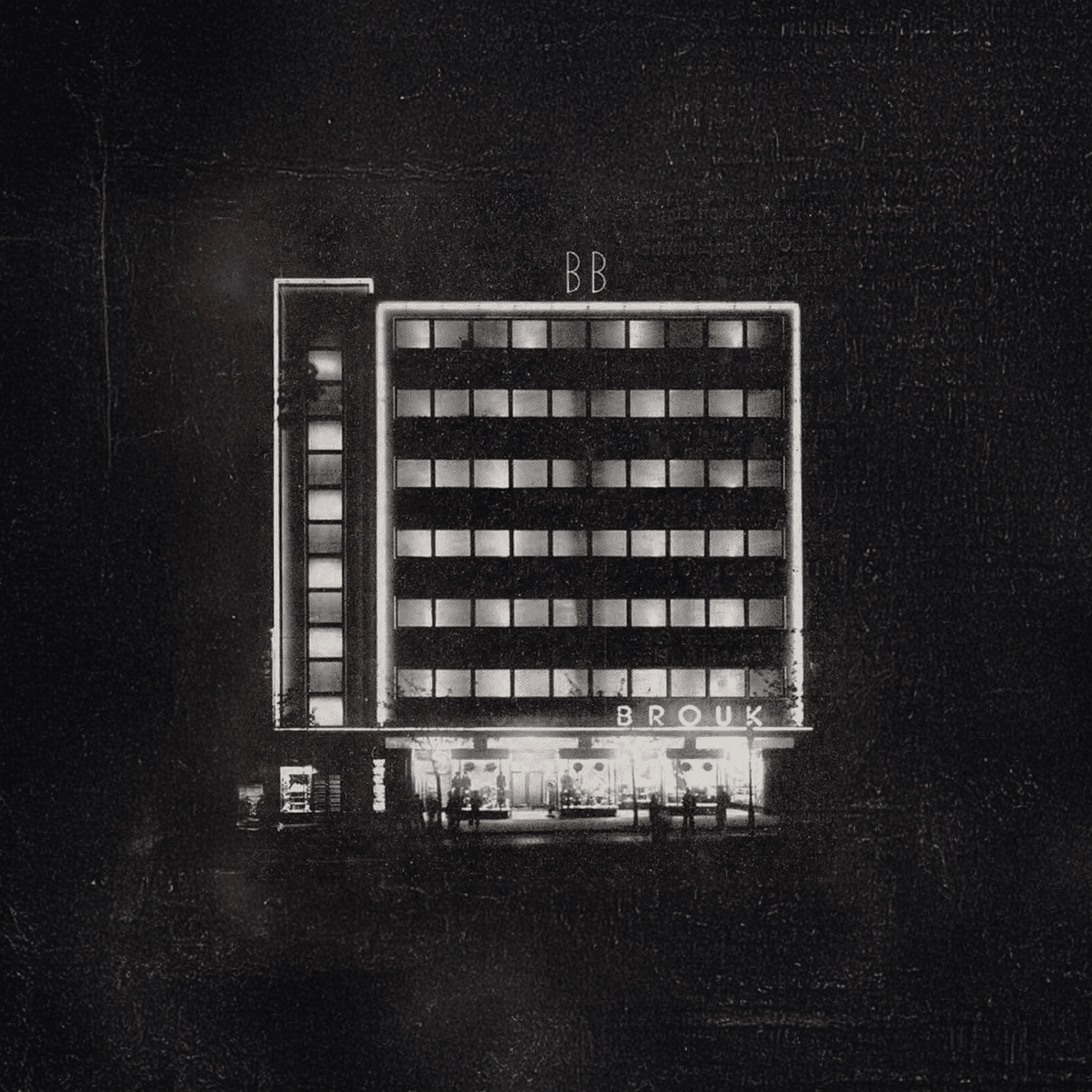
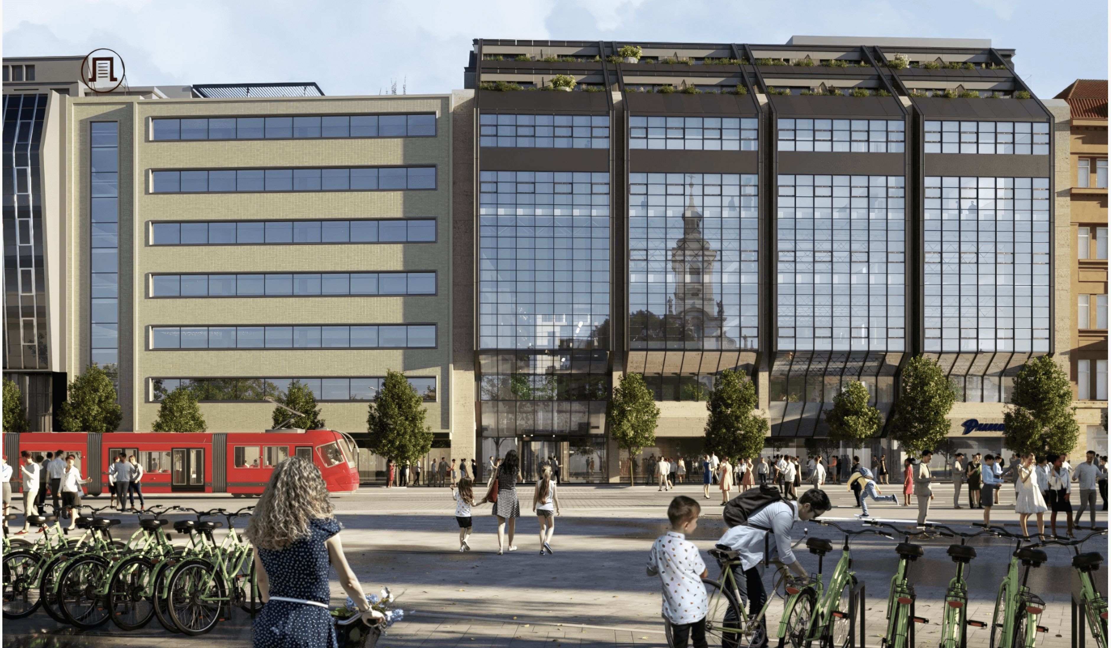
Dunaj is an iconic building in the heart of Bratislava, currently undergoing renovation. We were asked to create an identity for this new chapter, one that carries the same sense of continuity as every restoration before it.
The identity was designed to support the architecture, honor the history, and reflect the building’s new function, while aligning with the values of developer CTP.
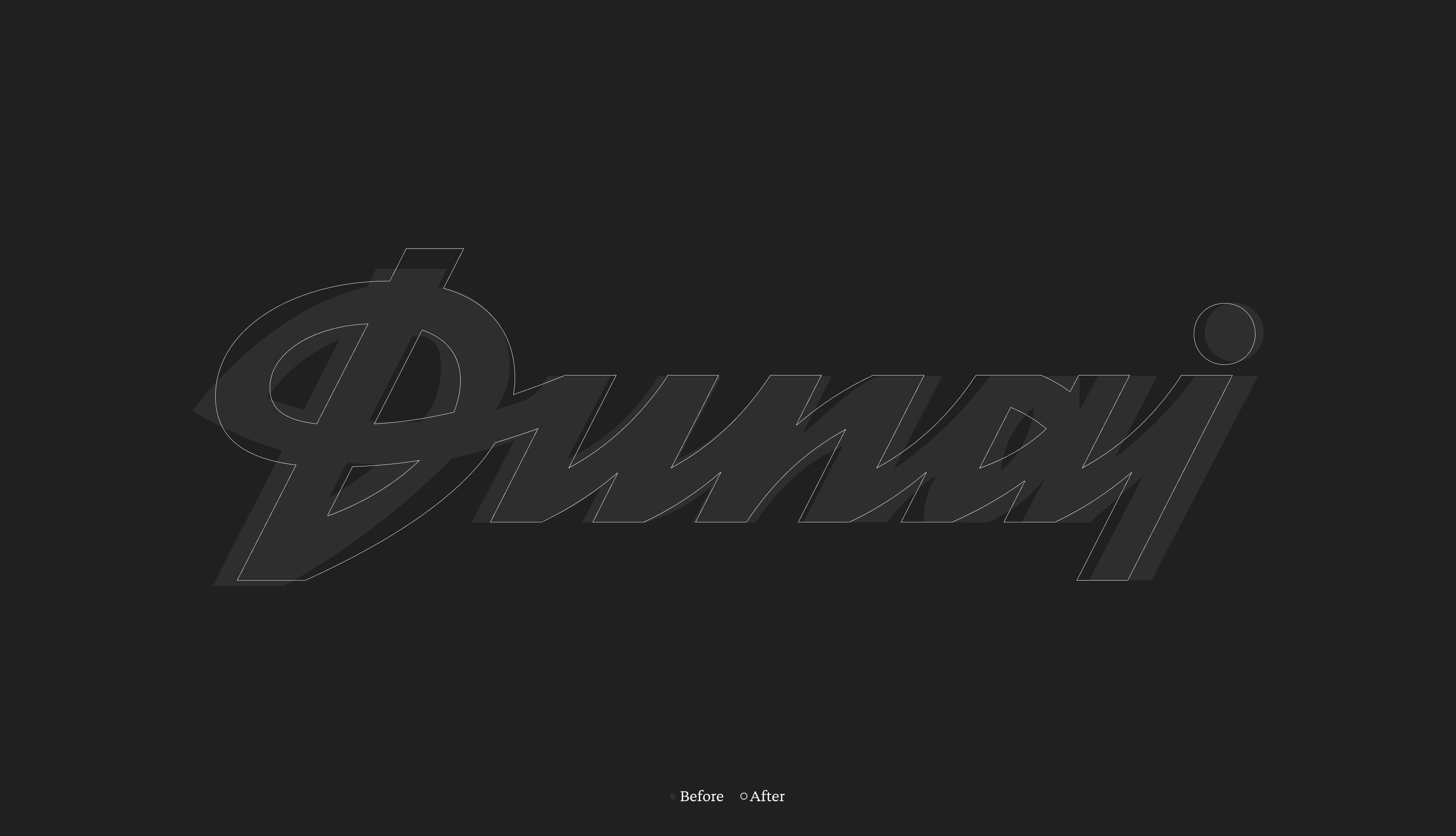
We refreshed the original Dunaj lettering, reintroduced the historic BB logo of Brouk a Babka, and created a custom typeface inspired by typography from an earlier renovation. These anchors keep the building recognizable, while the overall identity stays intentionally subtle — evoking calm and spaciousness inside, and connecting naturally with CTP’s approach of respecting the spirit of each place.

“OD Dunaj is a special place for us. We’ve held exhibitions there, launched projects, and experienced community and culture. That made us feel even more responsible for designing an identity that wouldn’t shout, but would respectfully support the building’s architecture, history, and new purpose.”
Jakub Ptačin, Strategy Director
“From the start, we knew OD Dunaj didn’t need a fashionable look or a trendy design. It needed a timeless identity, something that could grow and age with the building, yet always feel right. We designed it to complement the architecture, not compete with it, just like Dunaj has quietly blended into the rhythm of the city for decades.”
Maroš Ľuba, Creative Director