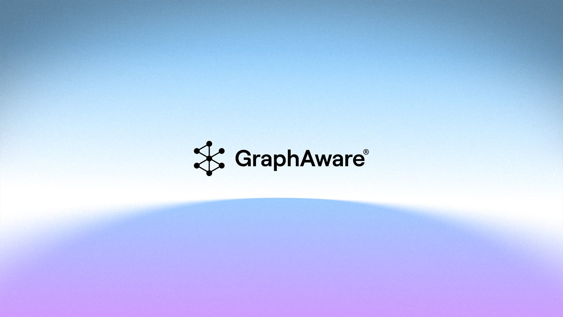
Graphaware
We redefined Graphaware’s brand to make their complex offering clear.
What we do
- Digital Design
- Motion & Video
- Print Design
- Visual Identity
- Web Development
- Tech & Startups
Overview
We redefined Graphaware’s brand to make their complex offering clear.
They reached a point where their brand no longer reflected the quality of their graph-powered intelligence technology on a global stage. At the same time, their product architecture was evolving in a direction that would be increasingly difficult to scale and maintain.
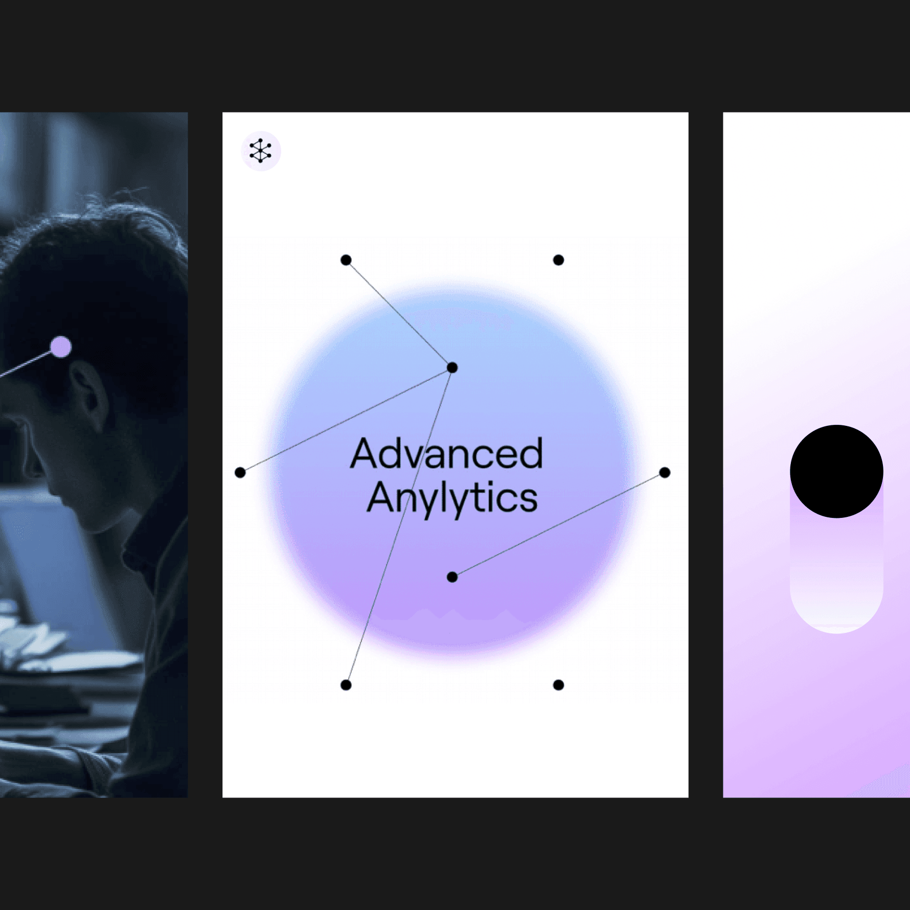
The Dot System
The visual system builds on the original logo and evolves it into a modular grid of dots. This system adapts and morphs depending on context.
We also work with the dot at a macro level. It becomes a mask, a gradient, or a spatial element. The color transitions are carefully designed to stay rooted in the original identity.
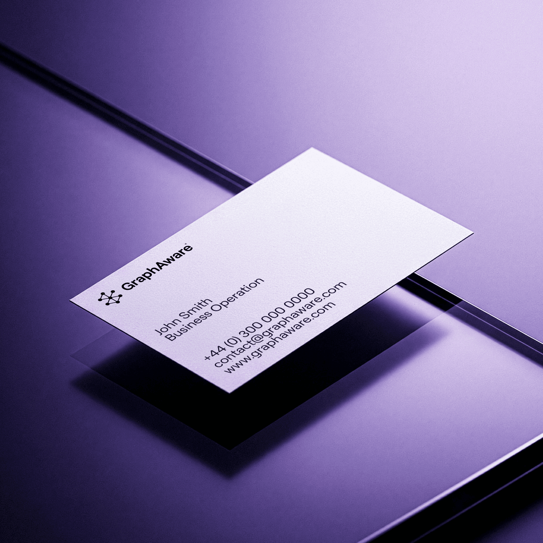
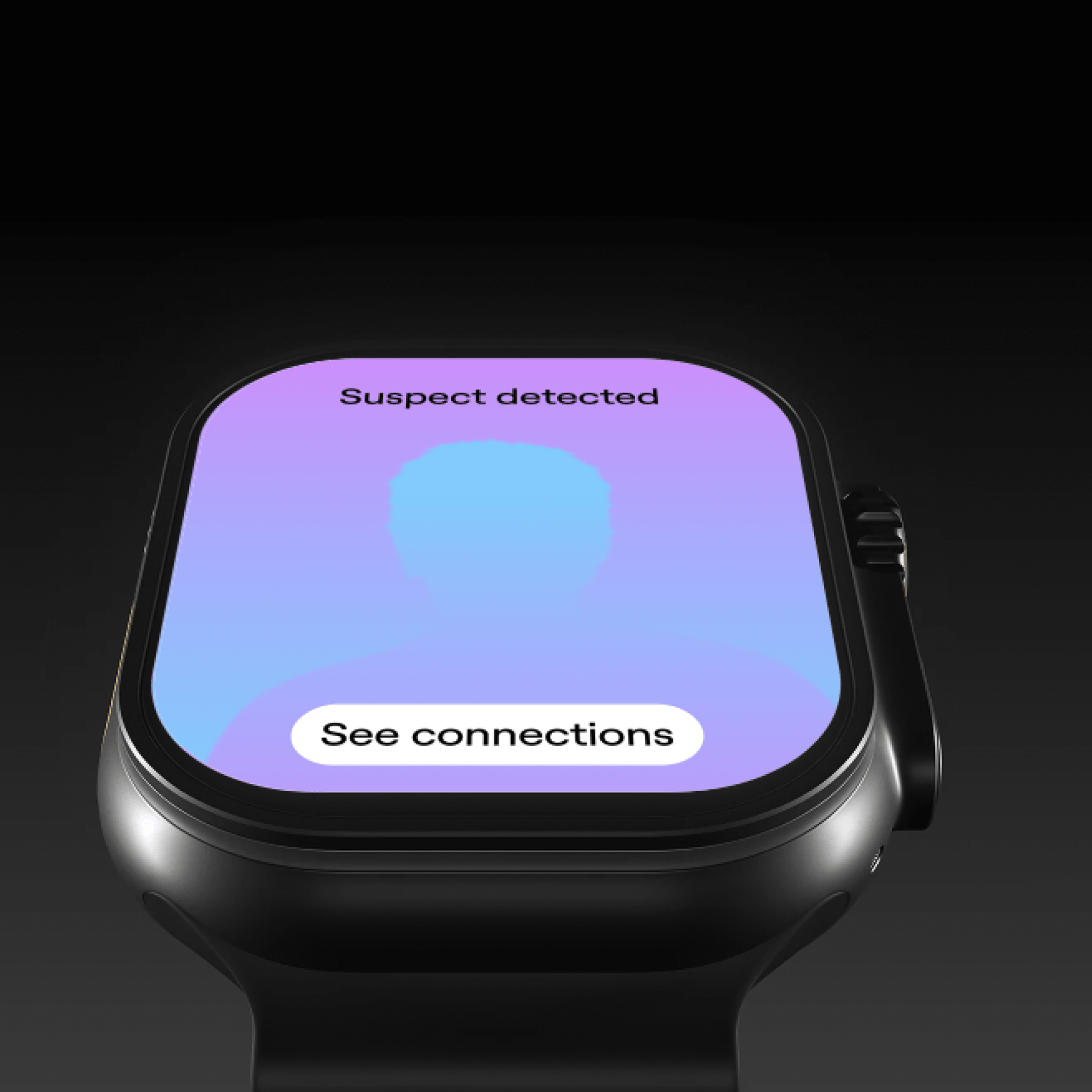
Application System
A key principle is clarity. At any moment, it must be obvious whether you’re looking at a real product interface or an illustrative layer. This distinction is critical for building trust.
We developed a system for transforming photography and supporting visuals, along with an illustration style that complements the product rather than competing with it.
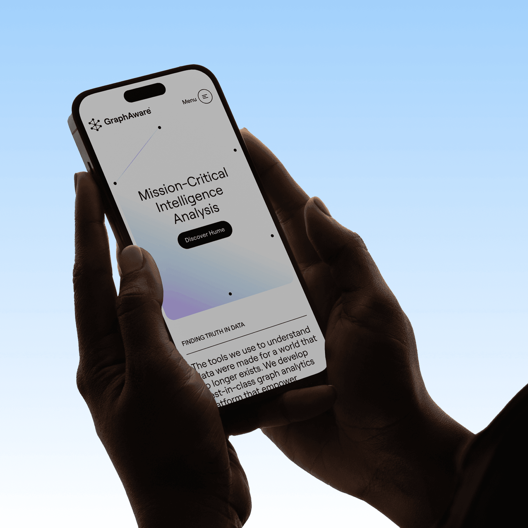
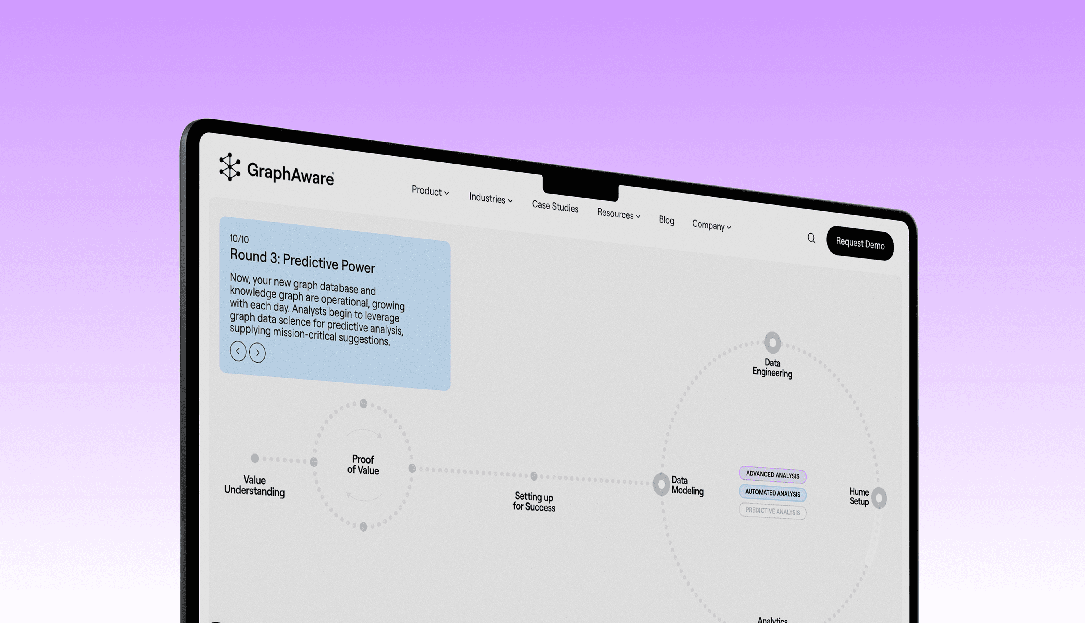
Website
The website extends the visual system through subtle gradients, the dot-based logic, and the illustration framework. It’s built to handle large volumes of highly technical content while supporting B2B lead generation and offline sales activities.
Credits
Maroš Ľuba,
Andrej Barčák,
Andrej Čanecký,
Martin Gross,
Alex Korosfoy,
Jakub Koričanský,
Samuel Hagara,
Martin Ferenc,
Tomáš Škarba,
Jozef Koleják,
Michal Chovaňák