Phase is a Slovak furniture brand with high-quality products, great in-store customer service and local European manufacturers. We made sure their communication strategy and flexible branding system reflected that, increased brand awareness and attracted another generation of shoppers to their showrooms.
Phase
Harnessing the power of closeness
What we do
- AI Visuals
- Brandtruth™ Strategy
- Digital Design
- Motion & Video
- Print Design
- Visual Identity
- Food & Retail
Overview
The Challenge
The high-end Slovak sofa and furniture brand Phase realised their brand communication had not attracted the right kind of audience to their products. The general audience had the impression their products were too expensive, while at the same time, their website made them look cheaper than they are. Looking to match the brand feel to the quality of their sofas, they reached out to Echt Brands to improve brand awareness and increase showroom footfall.
Strategy
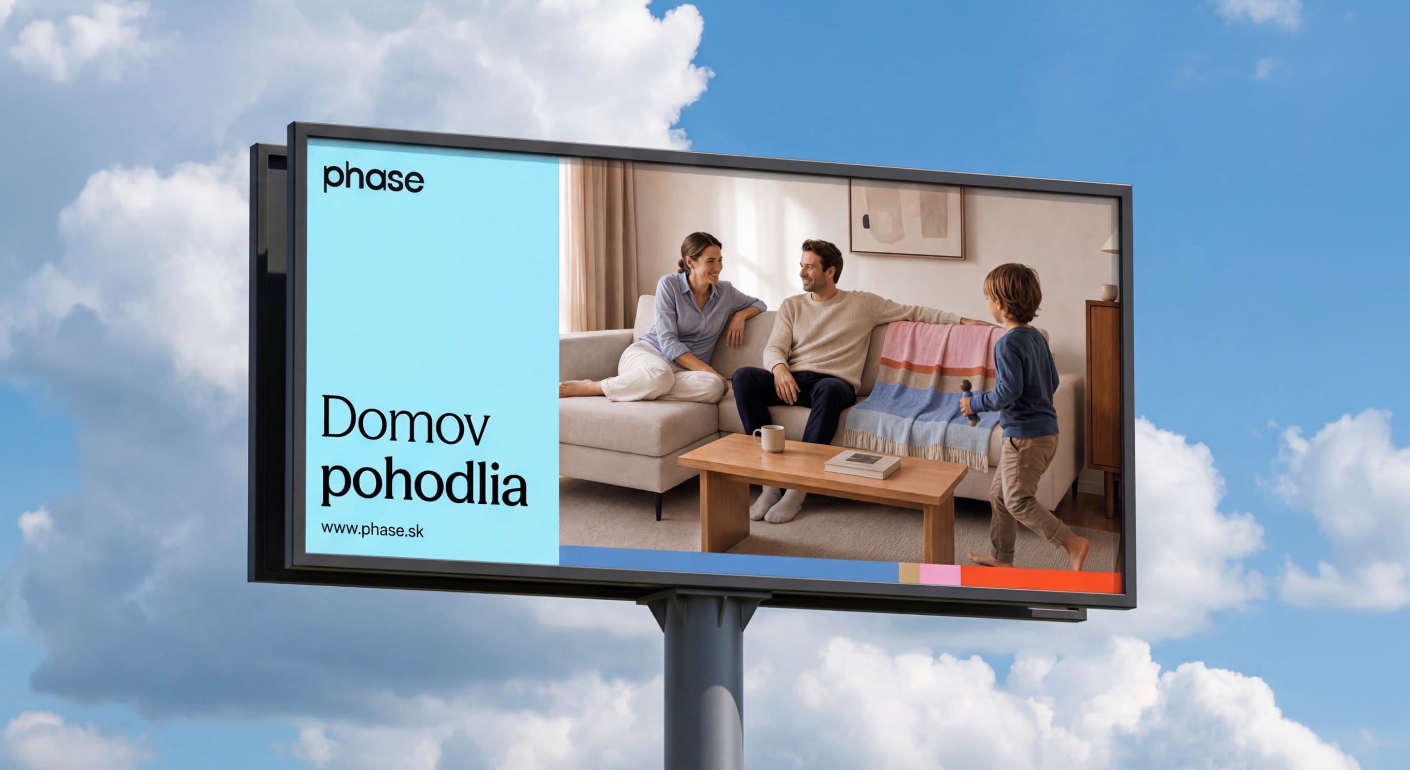
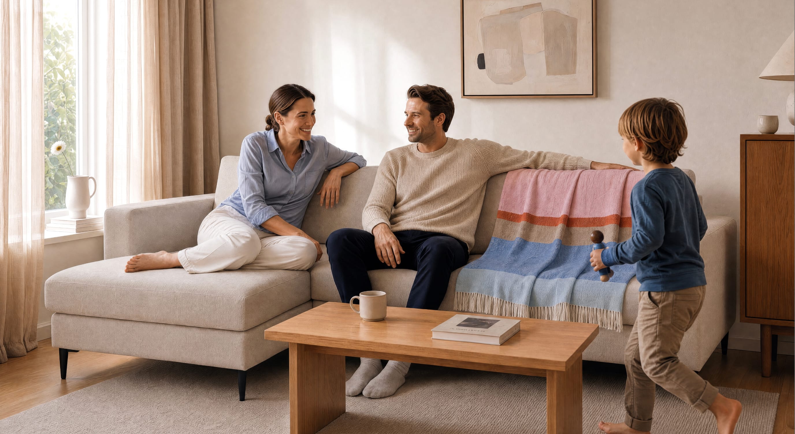
We have built the brand strategy with the goal of decreasing the mental load of their customers on the principle of closeness. Phase in multiple senses of the word: physical, emotional and mental. First of all, they have more showrooms in smaller towns than their competitors and the products are manufactured in Europe. Secondly, phase understands the local tastes in furniture and their customer service is lauded. Last but not least, they are willing to create bespoke pieces to fit the vision and comfort of their clients as closely as possible. We chose the slogan Home of Comfort to represent that.
Visual Identity
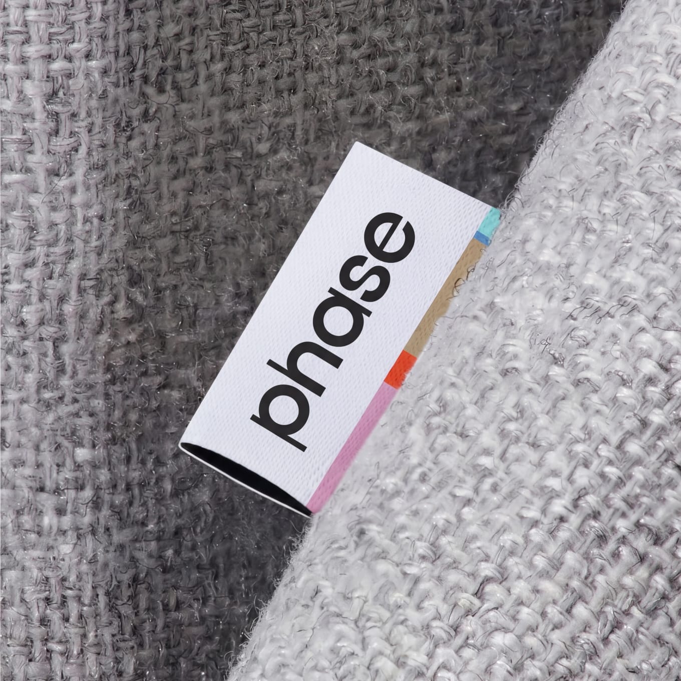
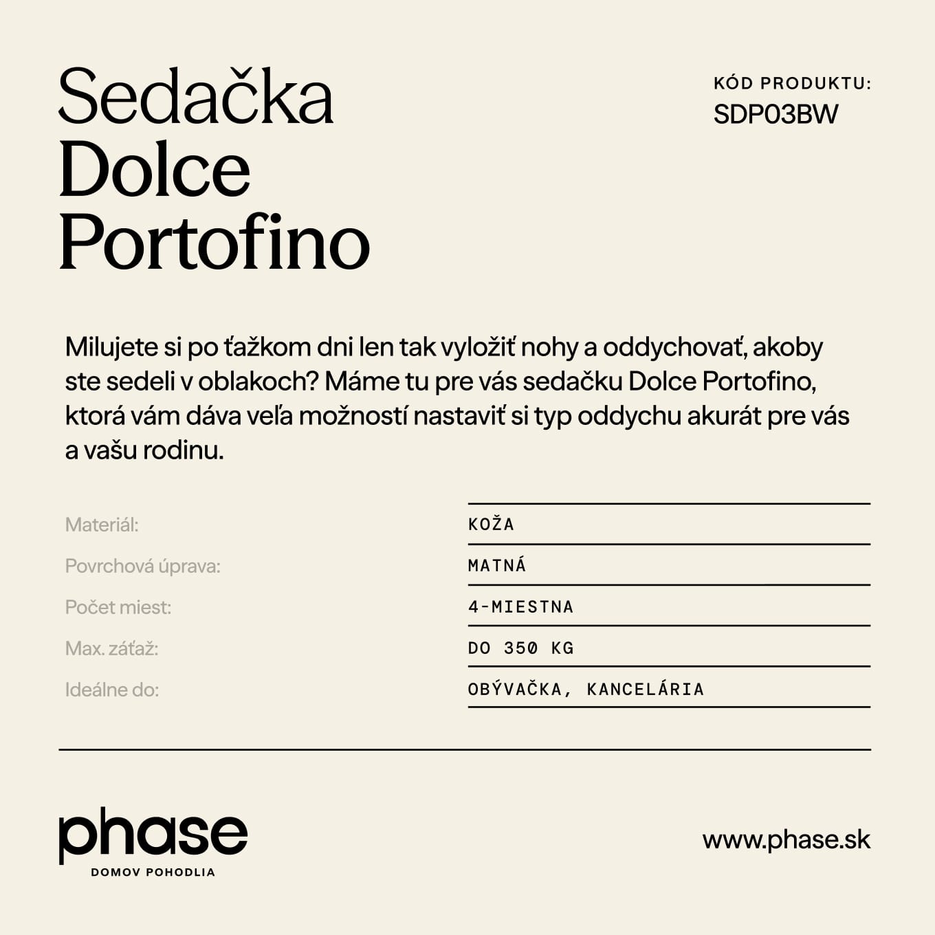
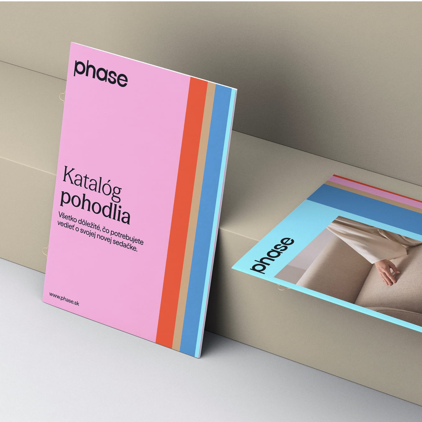
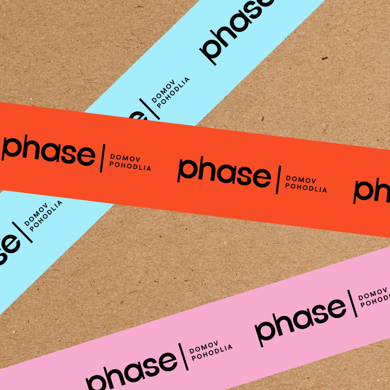
The new dynamic brand system is based on colourful stripes of varying widths. It allows for flexibility with colour fields, photography and typography without losing the identity’s cohesive character. In the new logo, this flexibility is reflected in the alternation of two line weights, creating a subtle, natural rhythm.
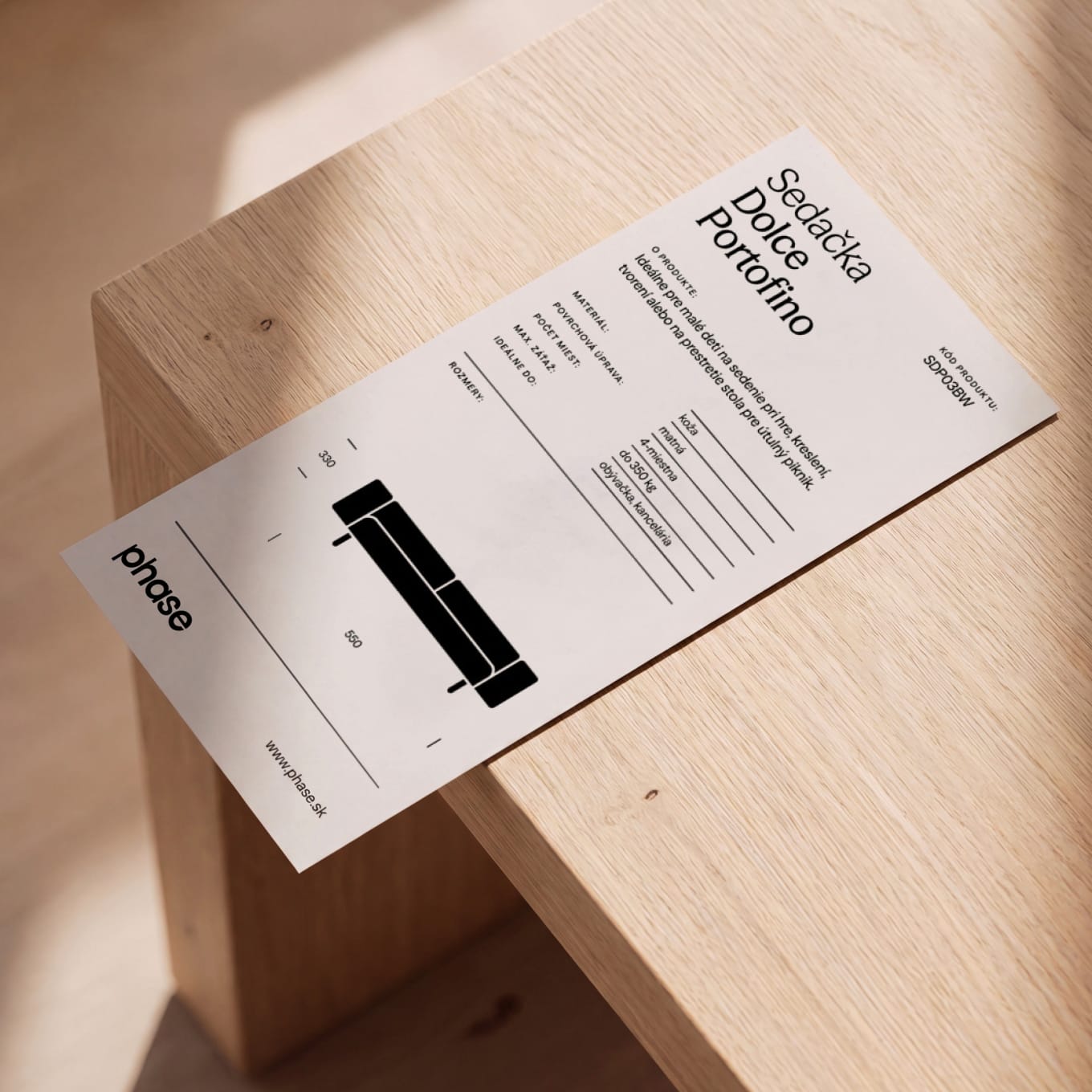
The typographic system is built on the contrast between a serif and sans-serif typeface from the same family: Season Mix for headings and Season Sans for informational text.
The Outcome
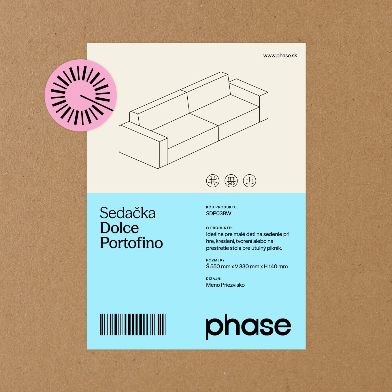
We made Phase into a brand that lessens the mental load of their customers by leveraging the company’s biggest asset: the closeness to its customers and the deep understanding of their needs that comes with it. In practice, that means we created a straightforward information system for their showrooms, used distinctive brand assets across all communication channels and made sure the premium quality of their products is clearly communicated.
Credits
- Jakub Ptačin
- Ondrej Kořínek
- Martin Pajerský
- Maroš Ľuba
- Ester Lysá
- Ľubomír Briestenský
- Michaela Badžgoňová
- Nikoleta Gajarová
- Michal Chovaňák
- Ondrej Jób
- Adam Zakucia
- Pablo Marin
- Dominik Budimir
- Matko Mijic
- Karina Krumlova
