Coach Potato
Creating a brand so kind it stands out in a saturated market for nutritional supplements
What we do
- Brandtruth™ Strategy
- Naming
- Visual Identity
- Food & Retail
Overview
Coach Potato is a new brand of nutritional supplements created as a response to the pressure-driven culture surrounding modern wellness. Instead of motivating people to keep pushing harder, the brand promotes a healthier relationship with performance and carved out a niche for itself with the focus on ‘anti-overdosing.’
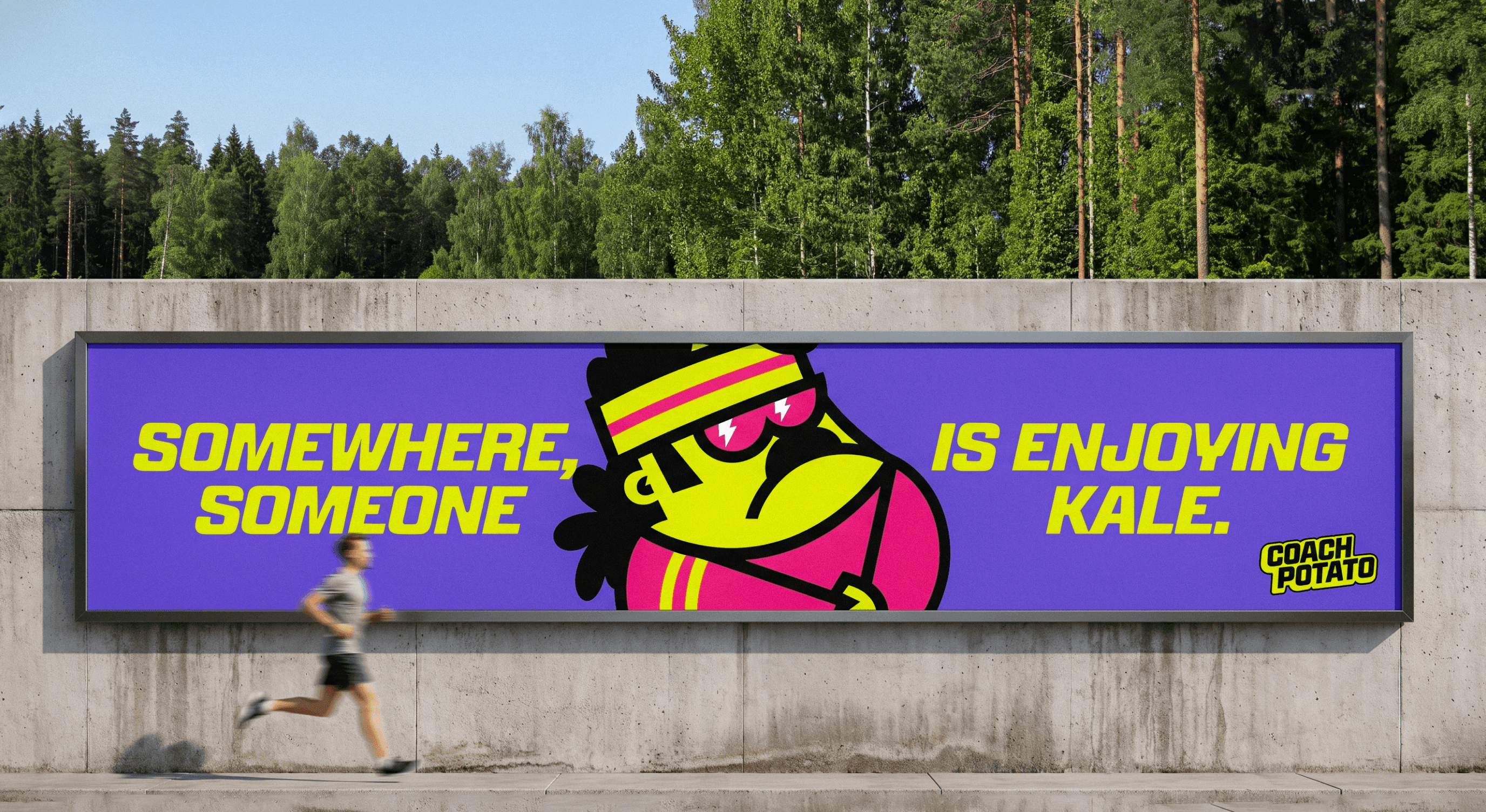
Their products are designed to be safe for long-term use, and provide customers with just enough of what their body needs. At the centre of the brand stands Coach Potato, a charismatic coach figure with a mullet, sunglasses, whistle, and unmistakable ‘Ted Lasso’ attitude. He looks intense, but his message is unexpectedly kind: take care of yourself, don’t overdo it. Coach Potato personifies the brand voice. He is supportive, self-aware, and motivating without pressure or judgement. Even if you are a bit of a couch potato.
The challenge
The nutritional supplement market is saturated with both more and less credible brands leaving potential customers unsure of who to trust. With customers increasingly critical of new nutritional supplement products, we had to convince the market that it is not just another brand that came to exploit the human feeling of inadequacy, but that they are bringing a truly useful, functional product.
Strategy
We found Coach Potato a unique communication niche: anti-overdosing. While many sports and nutrition brands encourage consumers to push harder, Coach Potato promotes balance, moderation, and “The Art of Enough.” The communication strategy, as well as the product itself, is built around the goal of giving the body exactly what it needs and nothing more. Thanks to their products, customers don’t have to spend their time trying to mix the exact combination of supplements for themselves and risk accidental overdosing from products competing on over-boosting their contents. There is no need for senseless, or even dangerous overachieving when it comes to supplementing an active lifestyle. With Coach Potato, you are enough. And he will tell you so in the tone of voice of a calm, optimistic friend who understands your drive as well as your exhaustion.
Sometimes, the wild-card ideas just hit the right spot. The pun of Coach Potato, with his care and likability of Ted Lasso, won everybody’s hearts over many more conventional naming options.
Visual Identity
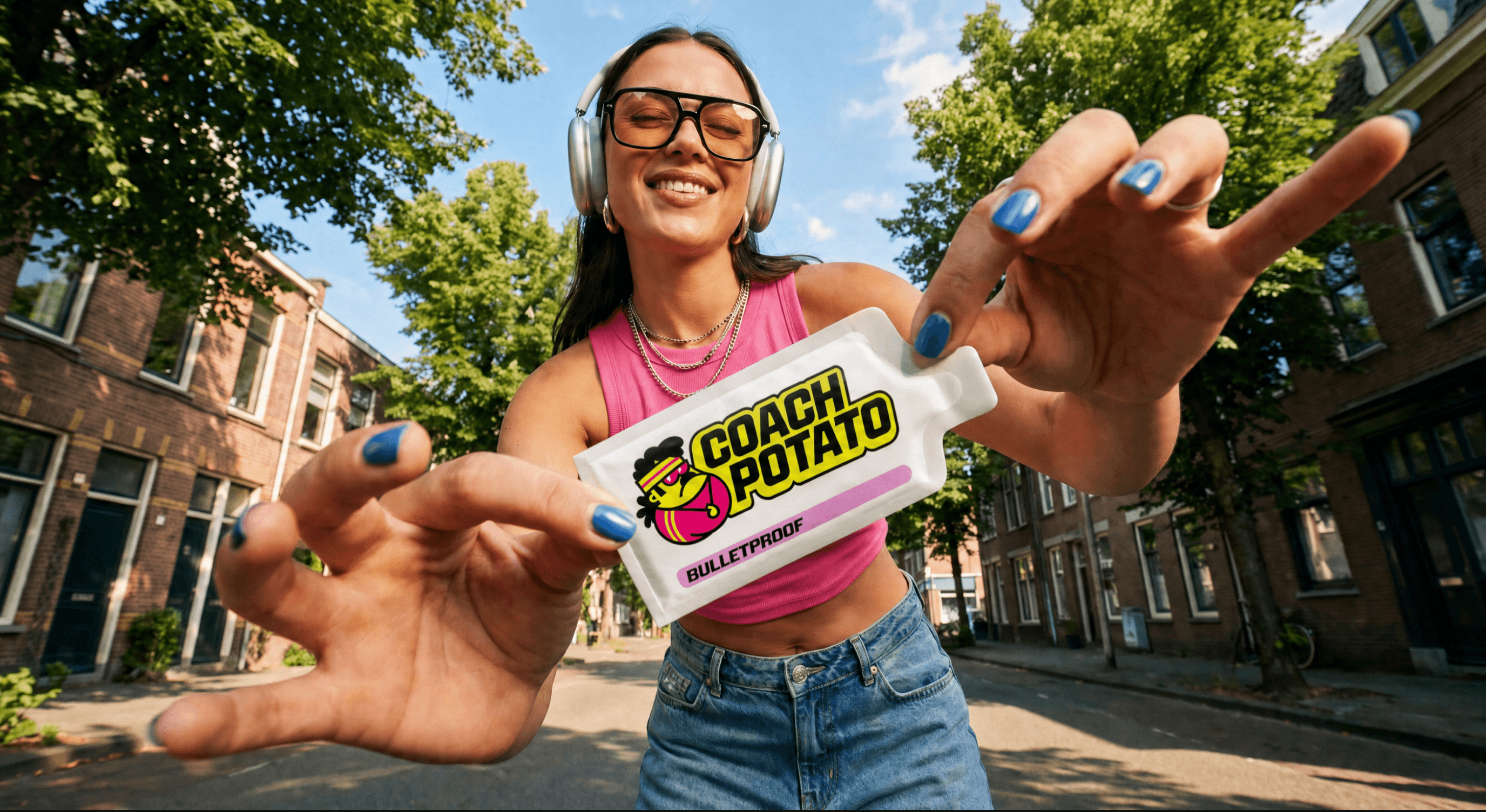
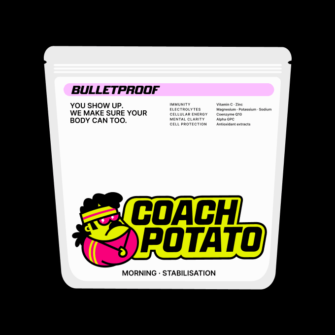
The visual identity was built around the expressive Coach Potato mascot as the primary brand asset. His exaggerated and playful proportions help to create instant recognition in the serious-looking supplement category.
The art direction combines vibrant neon colours, bold contrast, and oversized typography with a sense of humour and controlled chaos. Sticker-like graphic elements introduce movement, spontaneity, and flexibility across digital communication and social media.


What they say
Echt brands gave us a completely different perspective on our brand and made us realise what makes our business distinct. Our collaboration led to a unique name, design and strategy that stands out from the competition. We are already looking forward to working together again!

Marcel Šustek
Co-Owner, COACH POTATO

The outcome
We made Coach Potato into a brand that makes nutrition easy, friendly and lighthearted. In a world of nutritional overachievers, doing less is sometimes more. Coach Potato knows that wellness is not about discipline, but about feeling good and strong in your own skin.
Credits
Maroš Ľuba
Ondrej Kořínek
Jakub Ptačin
Marián Balog
Pavol Pružinec
Pablo Marin
Ondrej Jób
Tomáš Bánik
Michaela Badžgoňová
Matúš Hliboký
Aitana Kolnik
Karina Krumlová
Dominik Budimir
Matko Mijić
Zuzana Kvetková